Shadcn FAQ Block Three
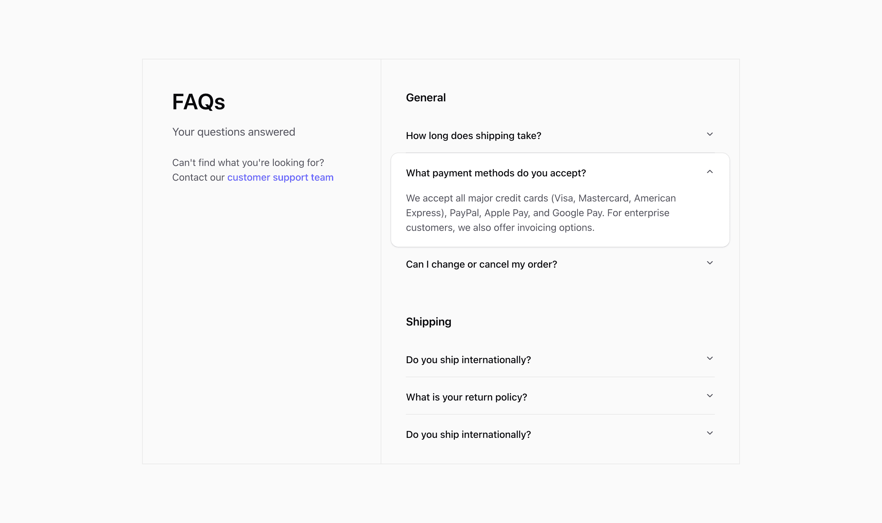
Shadcn FAQ Block Three keeps the side-intro structure but changes the accordion feel. The source uses the same General and Shipping demo groups, while the trigger styling removes the persistent border pattern and adds hover movement to the icon.
The questions and answers in the source use commerce-style demo content about shipping, payments, returns, and order changes. Replace them with real product, billing, onboarding, support, or compliance questions before using the FAQ section in production.
Interaction Style
The accordion still uses shadcn primitives, single expansion, and collapsible behavior. The notable difference is visual: trigger classes include not-group-last:border-b and hover transforms on the SVG icon, making the FAQ feel lighter than the card-ring variant.
Layout Pattern
The intro and support copy sit in a two-column md:grid-cols-5 layout. On mobile, the support prompt appears after the accordion list so it does not interrupt the questions.
Customization Notes
Choose this variant when you want the FAQ section to feel less boxed-in. It is a good fit for documentation-adjacent pages or a SaaS landing page that already has many cards above it.
Frequently Asked Questions
Does this variant use categories?
Yes. Questions are grouped, and each group has its own heading.
What should be checked after editing questions?
Make sure item IDs are unique within each accordion group and answers remain concise enough for collapsible reading.
Related Shadcn UI Blocks
Start from Tailark
Build with Tailark
Production-ready marketing blocks, pages, and illustrations for Shadcn UI.