Shadcn Expandable Feature Block Twenty
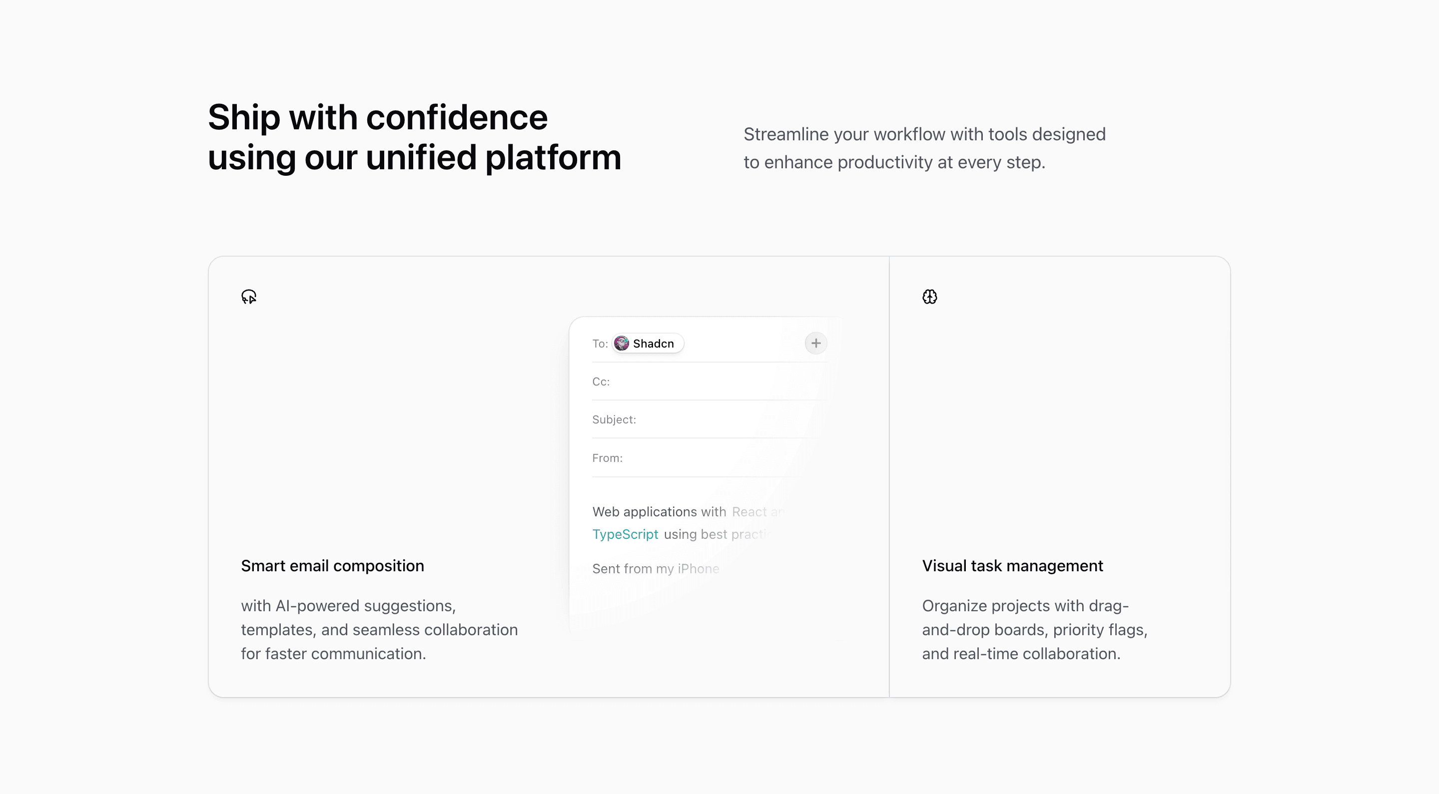
Block Twenty is the most card-like expandable features block in the set. Two Card components sit side by side, and the grid changes from 2fr 1fr to 1fr 2fr when the visitor selects the other capability.
How the section is built
The first card uses a LassoSelect icon and EmailIllustration for Smart email composition. The second uses a Brain icon and Kanban3Illustration for Visual task management. Both cards include full-surface buttons with aria-expanded state.
Interaction model
An interval alternates between the two cards every seven seconds, and clicking a card resets the timer. The width transition is handled entirely through Tailwind CSS grid-template classes.
Best fit
Use this React and Tailwind CSS block when your Next.js landing page needs progressive disclosure inside the feature section. It keeps the visitor on the same surface while still giving each product capability its own active state, illustration, and supporting copy.
Customization notes
The second card reuses the first card aria label in the source. Update that label along with the demo copy before shipping for better accessibility.
Keep the shadcn UI block conventions intact when you adapt it: short trigger labels, real product copy, accurate media alt text, and enough responsive testing to confirm the expanded state still feels intentional on mobile and desktop.
Related Shadcn UI blocks
Start from Tailark
Build with Tailark
Production-ready marketing blocks, pages, and illustrations for Shadcn UI.