Shadcn Expandable Feature Block Three
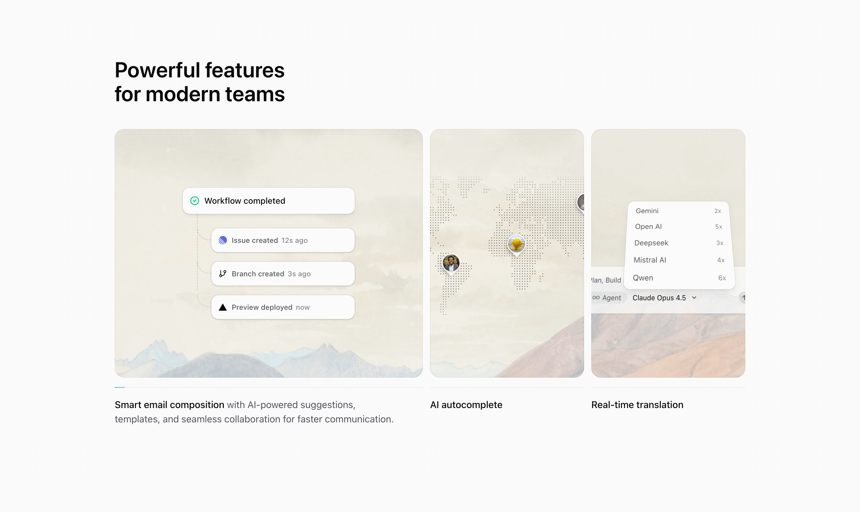
Block Three turns the two-card pattern into a wider three-column feature section. The source features are Smart email composition, AI autocomplete, and Real-time translation, each mapped to a local illustration and a background image.
How the section is built
The grid starts as three equal columns and shifts to 2fr 1fr 1fr, 1fr 2fr 1fr, or 1fr 1fr 2fr depending on expandedIndex. Tailwind CSS handles the width transition, while the text description fades and blurs for inactive cards through data-expanded selectors.
Interaction model
React state drives the active card, useMedia limits the autoplay behavior to medium screens, and the progress line restarts whenever the user selects a card. The section is best when each feature has short copy that can survive both collapsed and expanded widths.
Best fit
Use this React and Tailwind CSS block when your Next.js landing page needs progressive disclosure inside the feature section. It keeps the visitor on the same surface while still giving each product capability its own active state, illustration, and supporting copy.
Customization notes
The demo copy mixes email composition, autocomplete, and translation. Keep the three-item rhythm, but replace those labels with capabilities from your own SaaS or landing page.
Keep the shadcn UI block conventions intact when you adapt it: short trigger labels, real product copy, accurate media alt text, and enough responsive testing to confirm the expanded state still feels intentional on mobile and desktop.
Related Shadcn UI blocks
Start from Tailark
Build with Tailark
Production-ready marketing blocks, pages, and illustrations for Shadcn UI.