Shadcn Expandable Feature Block Six
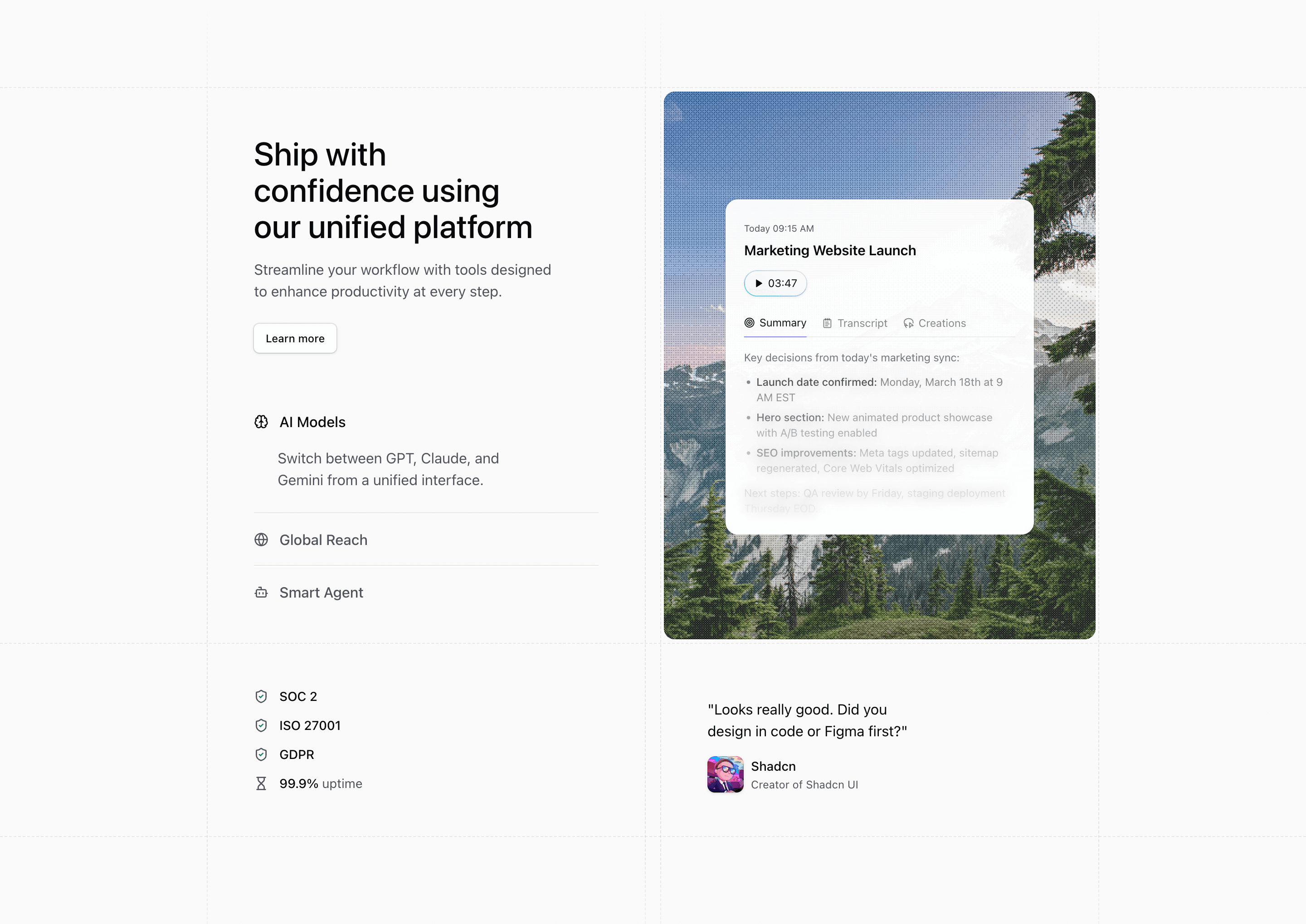
Block Six is closer to a landing page section than a simple feature picker. The left column contains the product headline, a Learn more button, and an accordion whose expanded row reveals feature copy; the right column swaps animated illustrations and images.
How the section is built
The accordion uses Tailwind grid rows (1fr and 0fr) to reveal copy without measuring height. Below the main grid, the source adds SOC 2, ISO 27001, GDPR, 99.9% uptime, and a Shadcn testimonial, which gives the section room for trust-building content.
Interaction model
Each feature row is a button with an icon and a controlled expandedIndex. Motion handles image and illustration transitions, while the surrounding dashed borders and rounded image panel keep the shadcn-style block structured.
Best fit
Use this React and Tailwind CSS block when your Next.js landing page needs progressive disclosure inside the feature section. It keeps the visitor on the same surface while still giving each product capability its own active state, illustration, and supporting copy.
Customization notes
The compliance badges and quote are demo proof points. Keep the supporting area only if those claims are true for your product; otherwise use customer metrics, integration logos, or onboarding notes.
Keep the shadcn UI block conventions intact when you adapt it: short trigger labels, real product copy, accurate media alt text, and enough responsive testing to confirm the expanded state still feels intentional on mobile and desktop.
Related Shadcn UI blocks
Start from Tailark
Build with Tailark
Production-ready marketing blocks, pages, and illustrations for Shadcn UI.