Shadcn Expandable Feature Block Seventeen
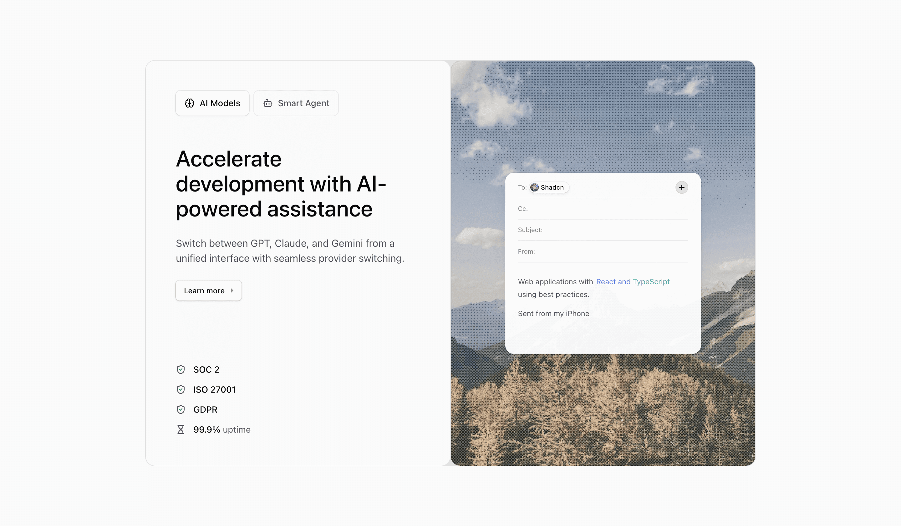
Block Seventeen packages the two-feature tab pattern into a polished card. The left side holds tab buttons, active title and description, CTA, and support content; the right side renders the active illustration over a background image.
How the section is built
The outer frame uses a one-pixel foreground grid and rounded card surfaces. The active tab receives an illustration background and ring treatment, and the media panel uses dither plus Motion to switch between EmailIllustration and AgentFeedbackIllustration.
Interaction model
The state model is manual: AI Models and Smart Agent buttons update expandedIndex. This makes the block useful when you want a controlled, compact shadcn UI block for two primary product capabilities.
Best fit
Use this React and Tailwind CSS block when your Next.js landing page needs progressive disclosure inside the feature section. It keeps the visitor on the same surface while still giving each product capability its own active state, illustration, and supporting copy.
Customization notes
The support areas use either compliance metrics or a Shadcn quote. Replace those with verified customer proof, or remove them if the page needs a simpler feature section.
Keep the shadcn UI block conventions intact when you adapt it: short trigger labels, real product copy, accurate media alt text, and enough responsive testing to confirm the expanded state still feels intentional on mobile and desktop.
Related Shadcn UI blocks
Start from Tailark
Build with Tailark
Production-ready marketing blocks, pages, and illustrations for Shadcn UI.