Shadcn Expandable Feature Block Nine
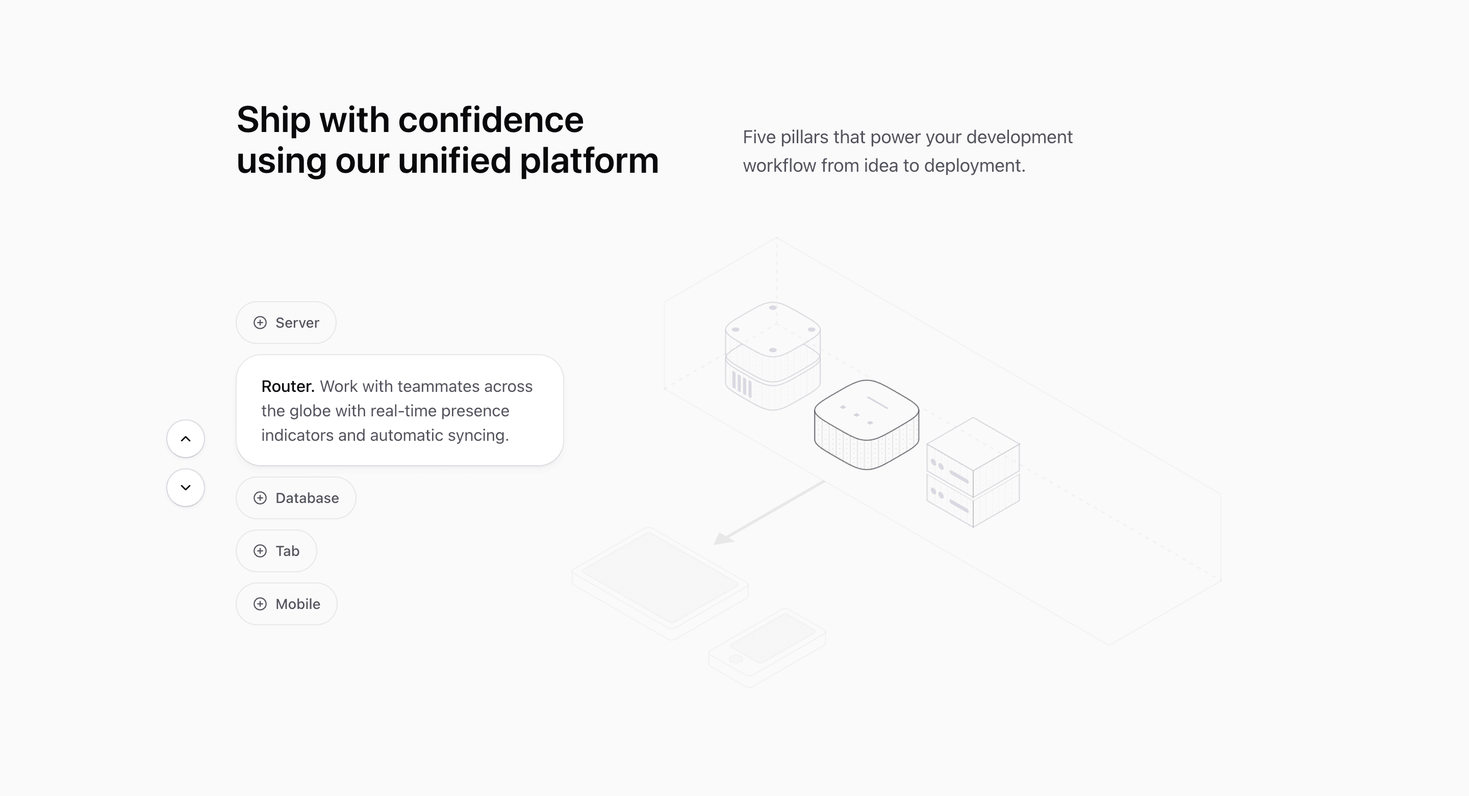
Block Nine is the most device-like variant in the expandable-features category. Five pill-shaped controls sit beside a SceneIllustration, and each selected row grows from a compact plus button into a larger rounded card with description text.
How the section is built
The source uses LayoutGroup and motion.div layout animation so the capsules resize smoothly. When a feature is active, up and down icon buttons appear for stepping through the list, and SceneIllustration receives activeDevice so the graphic can respond to the selected item.
Interaction model
Unlike the autoplay blocks, this one can collapse back to no selection because expandedIndex is number | null. That makes it better for progressive disclosure where visitors choose when to open details.
Best fit
Use this React and Tailwind CSS block when your Next.js landing page needs progressive disclosure inside the feature section. It keeps the visitor on the same surface while still giving each product capability its own active state, illustration, and supporting copy.
Customization notes
Several feature descriptions repeat the same automation copy, and the labels include generic infrastructure terms. Replace them with product-specific devices, modules, or workflow steps.
Keep the shadcn UI block conventions intact when you adapt it: short trigger labels, real product copy, accurate media alt text, and enough responsive testing to confirm the expanded state still feels intentional on mobile and desktop.
Related Shadcn UI blocks
Start from Tailark
Build with Tailark
Production-ready marketing blocks, pages, and illustrations for Shadcn UI.