Shadcn Expandable Feature Block Five
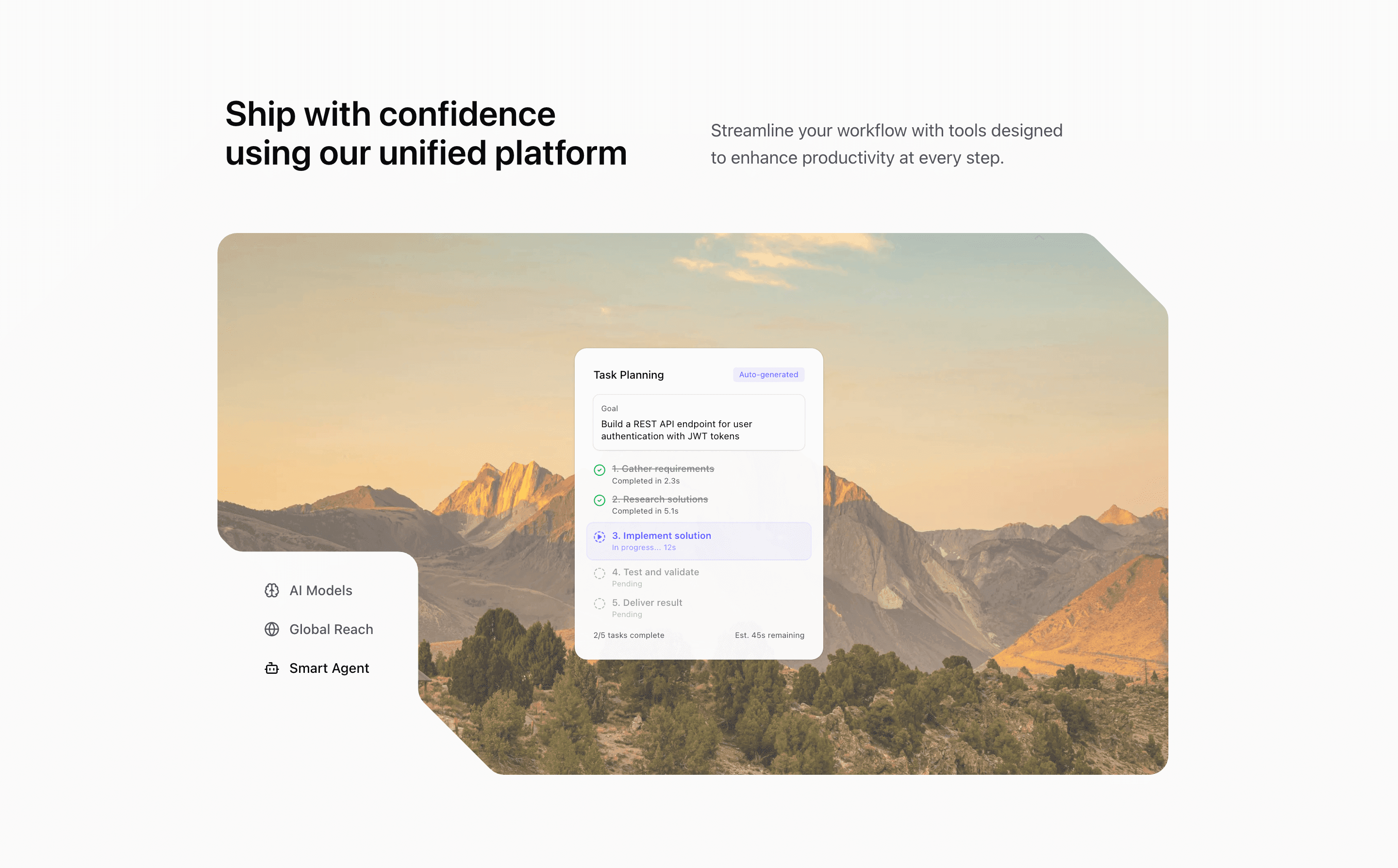
Block Five keeps the three-feature tab idea but gives the visual panel more room. The section opens with a headline and supporting paragraph, then places icon triggers near the image stage so the interaction feels like part of the composition.
How the section is built
The component imports Brain, Globe, and Bot icons from lucide-react, plus three local illustrations. The visual uses mask-[url(/illustration-mask.svg)], responsive aspect ratios, and Motion transitions to fade the active background image and scale the active illustration.
Interaction model
The state model is intentionally simple: click a trigger, update expandedIndex, and re-render the image/illustration pair. Since the triggers are text buttons, this variant works well when you want shadcn UI blocks that feel interactive without introducing complex controls.
Best fit
Use this React and Tailwind CSS block when your Next.js landing page needs progressive disclosure inside the feature section. It keeps the visitor on the same surface while still giving each product capability its own active state, illustration, and supporting copy.
Customization notes
The source relies on a mask asset and Unsplash images. If you change the aspect ratio or remove the mask, test the same section in Next.js at mobile and desktop widths.
Keep the shadcn UI block conventions intact when you adapt it: short trigger labels, real product copy, accurate media alt text, and enough responsive testing to confirm the expanded state still feels intentional on mobile and desktop.
Related Shadcn UI blocks
Start from Tailark
Build with Tailark
Production-ready marketing blocks, pages, and illustrations for Shadcn UI.