Shadcn Expandable Feature Block Fifteen
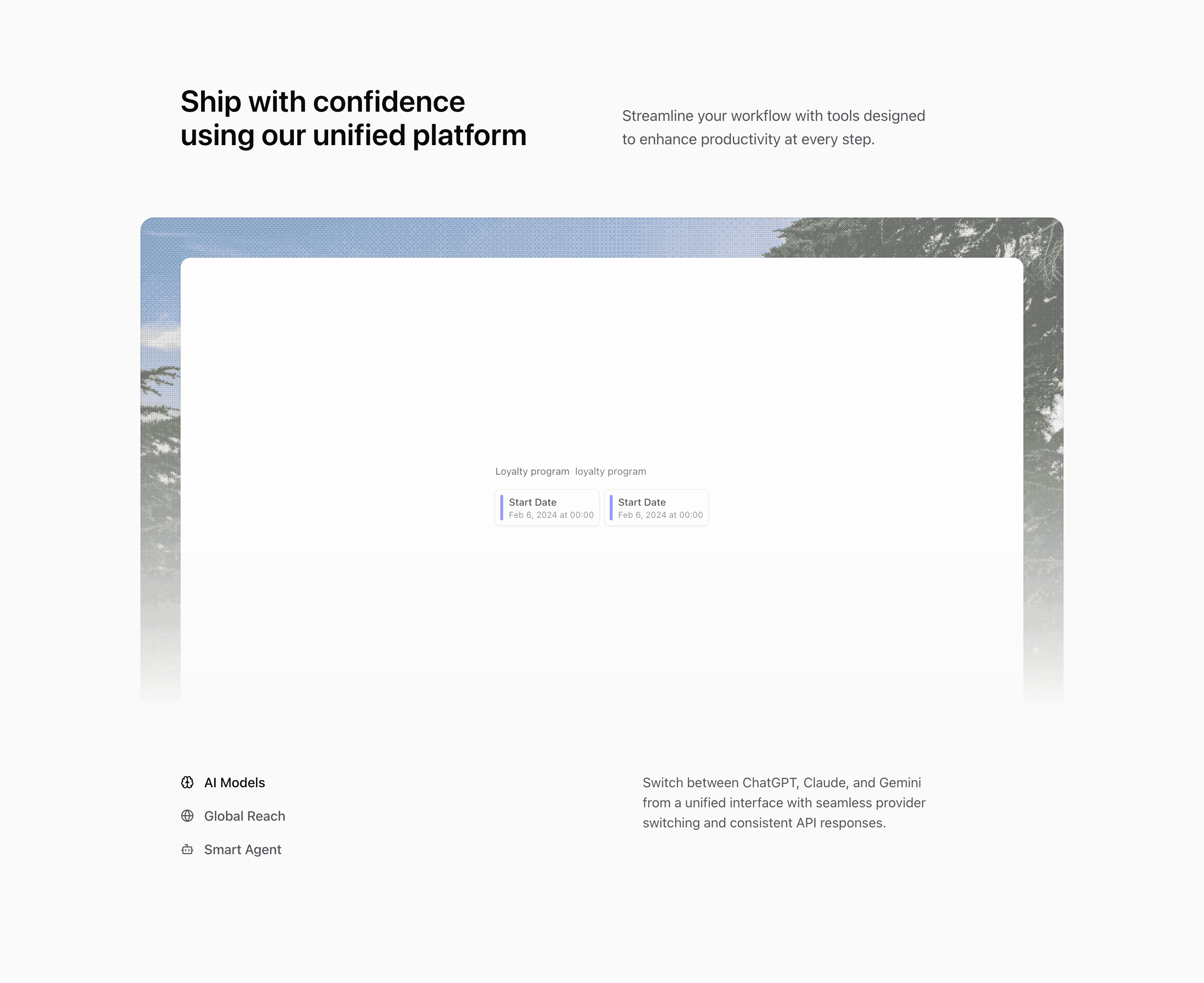
Block Fifteen keeps the same visual assets as Block Fourteen but changes the control layout. Instead of three equal bottom cells, it places the feature buttons in a vertical stack and reserves a neighboring column for the active description.
How the section is built
The top section uses a rounded media container with Motion-powered illustration and image changes. Below it, the trigger column uses lucide icons and hover backgrounds, while the description column shows the selected feature text.
Interaction model
The interaction is direct and predictable: click a trigger, update expandedIndex, and let the media panel and description refresh. It is a good choice when the feature names need to remain compact but the descriptions need more breathing room.
Best fit
Use this React and Tailwind CSS block when your Next.js landing page needs progressive disclosure inside the feature section. It keeps the visitor on the same surface while still giving each product capability its own active state, illustration, and supporting copy.
Customization notes
The demo descriptions reference ChatGPT, Claude, Gemini, global collaboration, and agents. Keep those terms only if the actual product supports them.
Keep the shadcn UI block conventions intact when you adapt it: short trigger labels, real product copy, accurate media alt text, and enough responsive testing to confirm the expanded state still feels intentional on mobile and desktop.
Related Shadcn UI blocks
Start from Tailark
Build with Tailark
Production-ready marketing blocks, pages, and illustrations for Shadcn UI.