Shadcn Expandable Feature Block Eleven
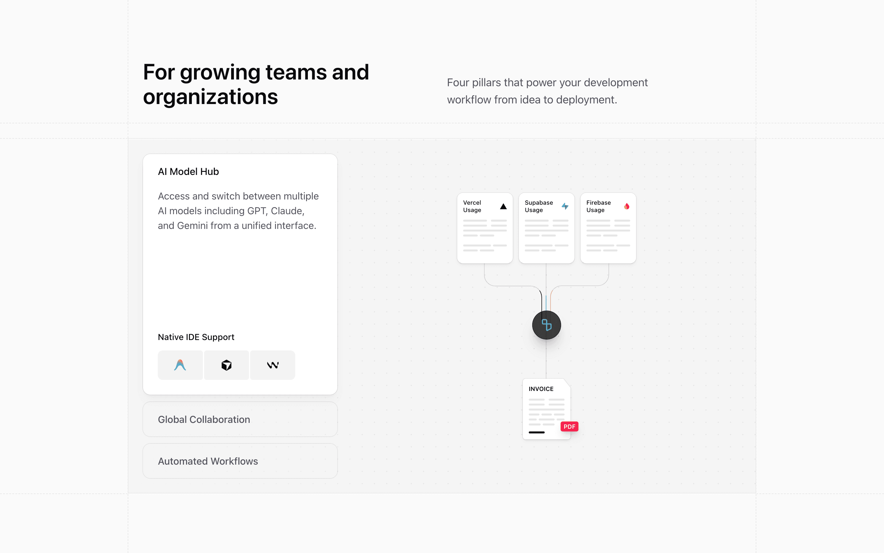
Block Eleven is built around a boxed grid with a subtle dot background. It reads like a technical product section: three expandable rows on the left and a large illustration stage on the right.
How the section is built
The features pair AI Model Hub, Global Collaboration, and Automated Workflows with local illustrations (FlowIllustration, KanbanIllustration, and AiSearchIllustration). Support content changes per feature: IDE logos, compliance metrics, or the Shadcn testimonial.
Interaction model
An interval advances the active row every seven seconds, and clicking a row resets that interval. The accordion uses grid-row transitions, while Motion fades and blurs the active illustration into the right panel.
Best fit
Use this React and Tailwind CSS block when your Next.js landing page needs progressive disclosure inside the feature section. It keeps the visitor on the same surface while still giving each product capability its own active state, illustration, and supporting copy.
Customization notes
The subheading says four pillars, but the array contains three features. Fix that copy if you use the component directly, and replace any trust proof that is not accurate for your SaaS.
Keep the shadcn UI block conventions intact when you adapt it: short trigger labels, real product copy, accurate media alt text, and enough responsive testing to confirm the expanded state still feels intentional on mobile and desktop.
Related Shadcn UI blocks
Start from Tailark
Build with Tailark
Production-ready marketing blocks, pages, and illustrations for Shadcn UI.