Shadcn Expandable Feature Block Eighteen
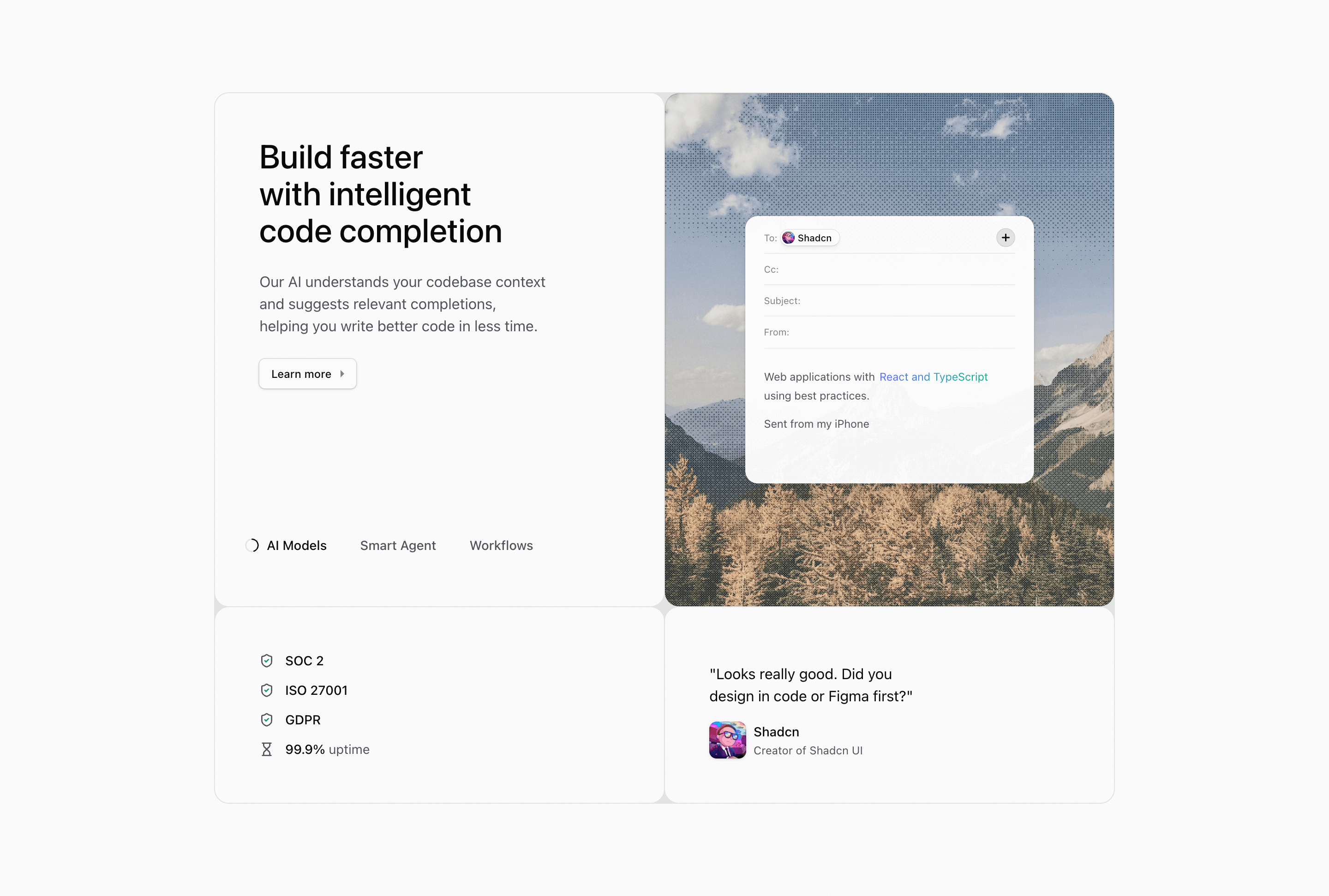
Block Eighteen combines the loader-pill behavior from Block Eight with the boxed card frame from Block Seventeen. It is designed for a landing page section that wants a guided feature tour plus extra proof panels.
How the section is built
The main grid has two columns on desktop, followed by separate rounded panels for compliance metrics and a testimonial. The active media panel uses EmailIllustration, AgentFeedbackIllustration, and AgentTaskPlanningIllustration over image backgrounds.
Interaction model
A six-second interval advances the active feature, and clicking a pill resets the timer. The active pill displays the SVG loader so visitors can see when the next state will arrive.
Best fit
Use this React and Tailwind CSS block when your Next.js landing page needs progressive disclosure inside the feature section. It keeps the visitor on the same surface while still giving each product capability its own active state, illustration, and supporting copy.
Customization notes
The headline is about intelligent code completion, while the feature labels cover broader platform ideas. Align the copy and replace generic image alt text before using the block as production content.
Keep the shadcn UI block conventions intact when you adapt it: short trigger labels, real product copy, accurate media alt text, and enough responsive testing to confirm the expanded state still feels intentional on mobile and desktop.
Related Shadcn UI blocks
Start from Tailark
Build with Tailark
Production-ready marketing blocks, pages, and illustrations for Shadcn UI.