Shadcn Content Block Two
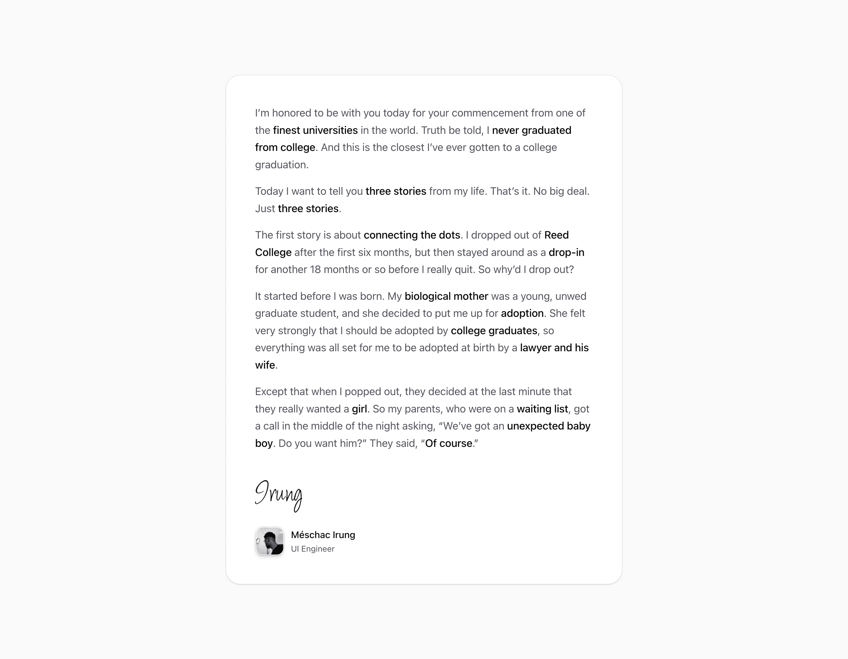
Block Two removes the expand/collapse behavior and presents the same placeholder prose inside a rounded card. The lower area adds a large inline SVG signature, an avatar loaded through Next.js Image, and an author label for Meschac Irung, UI Engineer.
Use this content section when the explanation should read like a signed note, testimonial, or editorial product statement. The sample body should be replaced, but the source-backed structure is strong: prose first, then an author marker that can make long copy feel accountable.
The implementation is regular React and Tailwind CSS, so it can sit inside a Next.js route alongside other shadcn UI blocks. Ground the final copy in product evidence, especially where the source demo text is placeholder or borrowed.
What to customize
- Replace the speech excerpt before publishing.
- Use a real author photo and role if the signature treatment stays.
- Keep the card width narrow enough for comfortable reading.
Implementation notes
Is this a content section or a feature section?
It is a content section: the source prioritizes explanation, media, and supporting copy over a dense feature grid.
Can I use it with shadcn?
Yes. Several variants use shadcn-compatible primitives such as Button and AspectRatio, while the rest are local markup styled with Tailwind CSS.
Related Shadcn UI blocks
Start from Tailark
Build with Tailark
Production-ready marketing blocks, pages, and illustrations for Shadcn UI.