Shadcn Content Block Seven
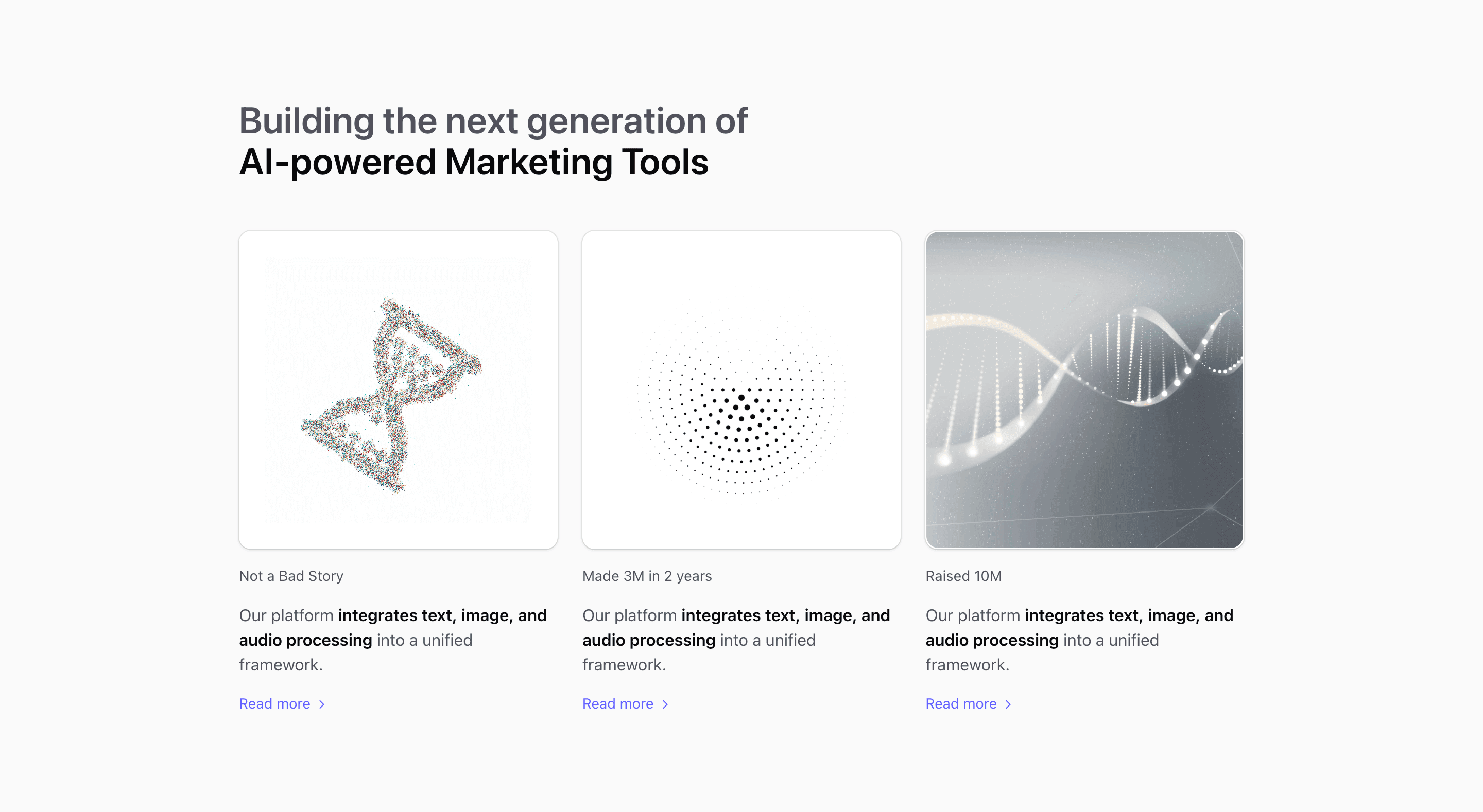
Block Seven uses container queries to move from one column to two and three columns. Each card contains an AspectRatio media area, a small heading, a short paragraph, and a Read more link with ChevronRight; the demo labels are awkward placeholders and should be treated as customization prompts.
Use this shadcn content section for related product stories, resource cards, or feature essays. The React source is simple, but the row-subgrid pattern keeps the media, copy, and link aligned across cards.
The implementation is regular React and Tailwind CSS, so it can sit inside a Next.js route alongside other shadcn UI blocks. Ground the final copy in product evidence, especially where the source demo text is placeholder or borrowed.
What to customize
- Replace placeholder labels like
Not a Bad Storywith real article or feature titles. - Point each
Read morelink to a relevant route, not a raw image URL. - Keep cards similar in density for a stable grid.
Implementation notes
Is this a content section or a feature section?
It is a content section: the source prioritizes explanation, media, and supporting copy over a dense feature grid.
Can I use it with shadcn?
Yes. Several variants use shadcn-compatible primitives such as Button and AspectRatio, while the rest are local markup styled with Tailwind CSS.
Related Shadcn UI blocks
Start from Tailark
Build with Tailark
Production-ready marketing blocks, pages, and illustrations for Shadcn UI.