Shadcn Content Block Four
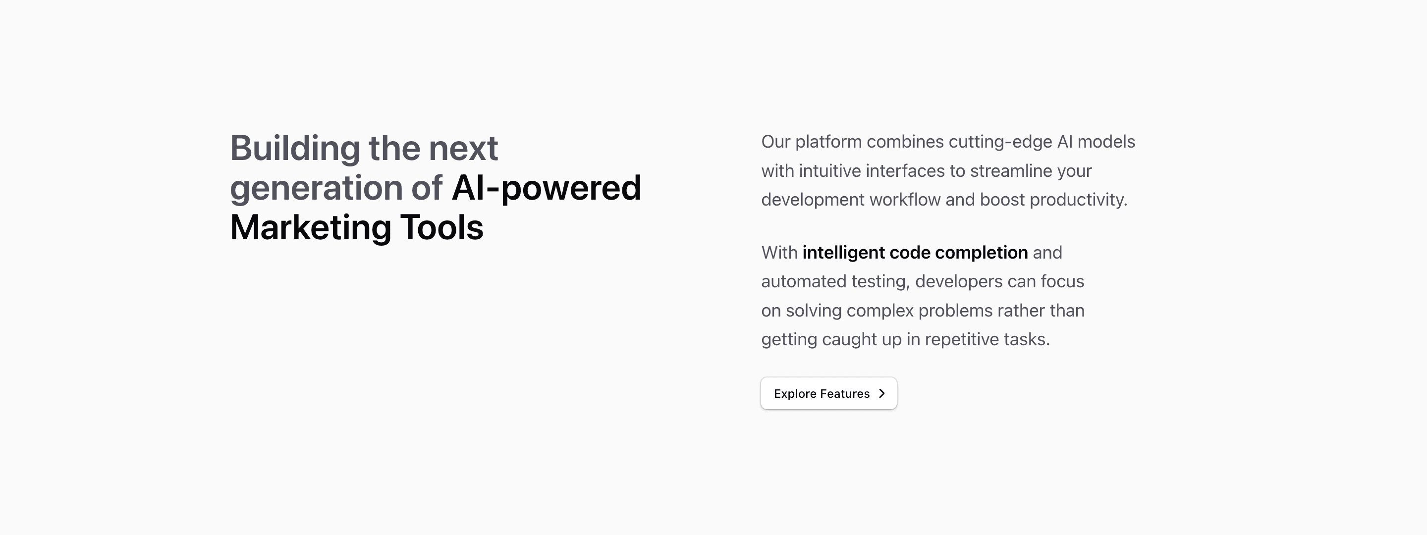
Block Four is a pure marketing copy layout: the left side carries a large muted headline with a highlighted phrase, while the right side includes two paragraphs and an outline shadcn Button linking to Explore Features with a ChevronRight icon.
Use it when a product page needs a short content section between heavier blocks. The source copy mentions AI-powered marketing tools and developer workflow, so treat it as placeholder guidance and replace it with a clear product claim plus one action.
The implementation is regular React and Tailwind CSS, so it can sit inside a Next.js route alongside other shadcn UI blocks. Ground the final copy in product evidence, especially where the source demo text is placeholder or borrowed.
What to customize
- Tie the button label to the page journey.
- Keep the highlighted phrase specific, not a generic category label.
- Preview the
lg:gap-24spacing with real copy.
Implementation notes
Is this a content section or a feature section?
It is a content section: the source prioritizes explanation, media, and supporting copy over a dense feature grid.
Can I use it with shadcn?
Yes. Several variants use shadcn-compatible primitives such as Button and AspectRatio, while the rest are local markup styled with Tailwind CSS.
Related Shadcn UI blocks
Start from Tailark
Build with Tailark
Production-ready marketing blocks, pages, and illustrations for Shadcn UI.