Shadcn Contact Block Two
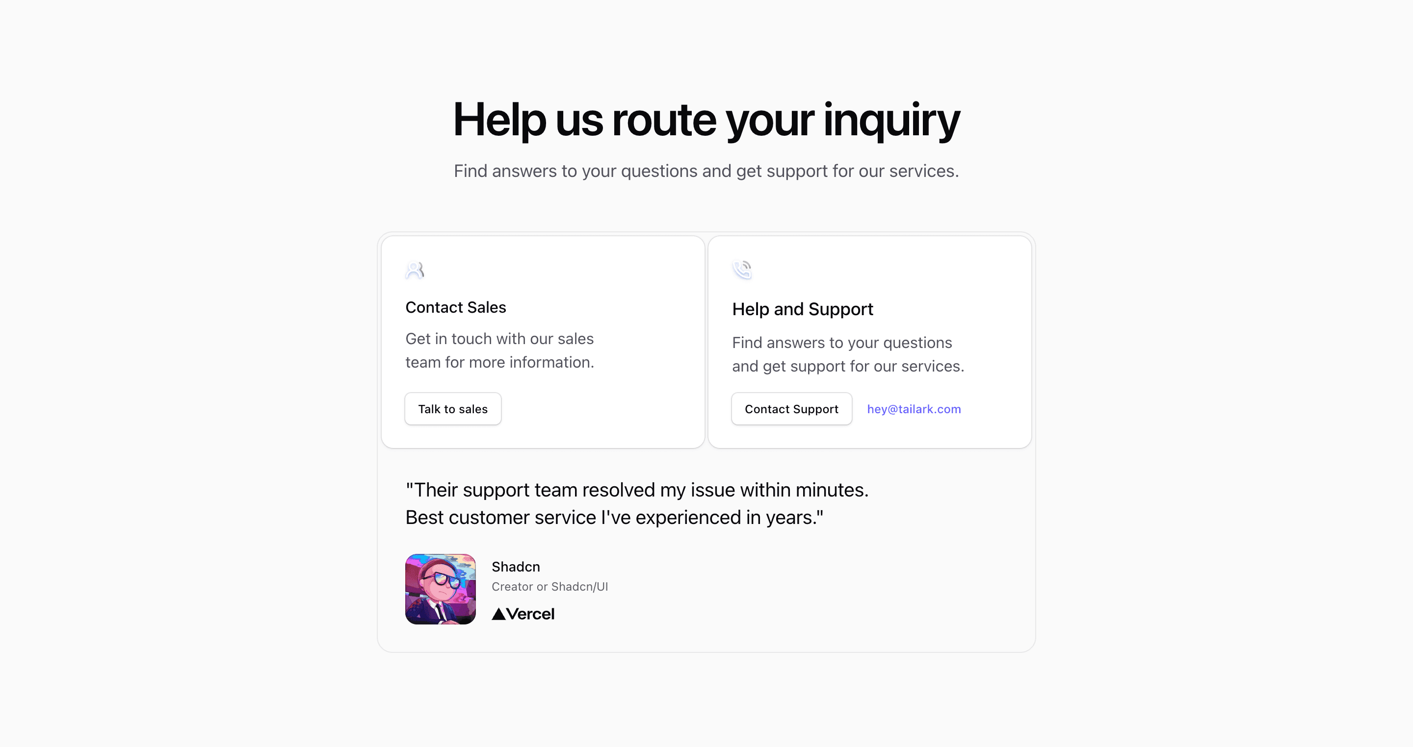
Shadcn Contact Block Two keeps the same sales/support split as the first contact section, but adds more trust and polish. The source imports Card, Button, Users2, PhoneCall, Image, and VercelFull, then uses two action cards above a testimonial-style panel with a Shadcn avatar and Vercel logo.
The quote and person details are demo content. Keep the pattern if you have a real support proof point; otherwise, replace the lower panel with a short operations note, response policy, or customer success message.
Card Structure
The top grid sits inside a rounded bordered frame and switches to two columns with @lg:grid-cols-2. Each card has a small icon treatment, a heading, supporting text, and a shadcn Button link. The lower panel spans the full grid, which gives the section a natural close after visitors choose between sales and help.
Responsive Behavior
Container queries drive the layout rather than viewport-only breakpoints. On mobile, the cards and testimonial stack cleanly; at wider sizes, the routing choices sit side by side while the testimonial keeps the full width.
Customization Notes
Use real support metrics, a verified quote, or remove the testimonial if you cannot support it. Replace #link targets and hey@tailark.com with actual routes. This React and Tailwind CSS structure works best when the contact choices stay short and directly actionable.
Frequently Asked Questions
Is the testimonial required?
No. It is part of the demo composition, not a functional requirement. Swap it for real proof or remove it.
Where does this fit best?
Use it on a SaaS landing page or support page where visitors should choose between sales and support, with a small credibility cue nearby.
Related Shadcn UI Blocks
Start from Tailark
Build with Tailark
Production-ready marketing blocks, pages, and illustrations for Shadcn UI.