Shadcn Contact Block Three
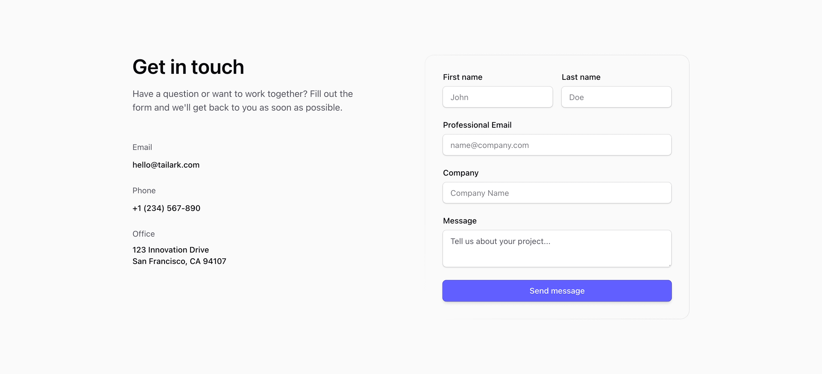
Shadcn Contact Block Three is a classic contact page layout: direct contact details first, form second. The React source lists email, phone, and office information on the left, then places a labeled form on the right with first name, last name, professional email, company, and message fields.
The contact details and placeholders are demo values. They are useful because they show the intended density of the section, but they should be replaced with real inboxes, phone numbers, office addresses, and submission handling.
Form Layout
The form uses shadcn Input, Label, Textarea, and Button components. First and last name share a sm:grid-cols-2 row, while email, company, and message stack below. A masked rounded border sits behind the form, giving the panel definition without making it feel like a heavy card.
Contact Details
Email, phone, and office blocks use simple labels and links. That makes the left side useful even when a visitor does not want to fill out the form. For a SaaS landing page, this is a practical pattern for enterprise or partnership inquiries.
Responsive Behavior
The section uses @2xl:grid-cols-2, so the form stacks beneath the intro until the container has enough room. Keep the form labels short so the two-column name row remains readable on small screens.
Frequently Asked Questions
Does the source submit the form anywhere?
No. It renders the UI only. Wire the form to your own action, validation, and spam protection before shipping.
What should be customized first?
Replace the demo contact details, update placeholders to match the data you need, and connect the submit button to the correct backend or CRM flow.
Related Shadcn UI Blocks
Start from Tailark
Build with Tailark
Production-ready marketing blocks, pages, and illustrations for Shadcn UI.