Shadcn Contact Block One
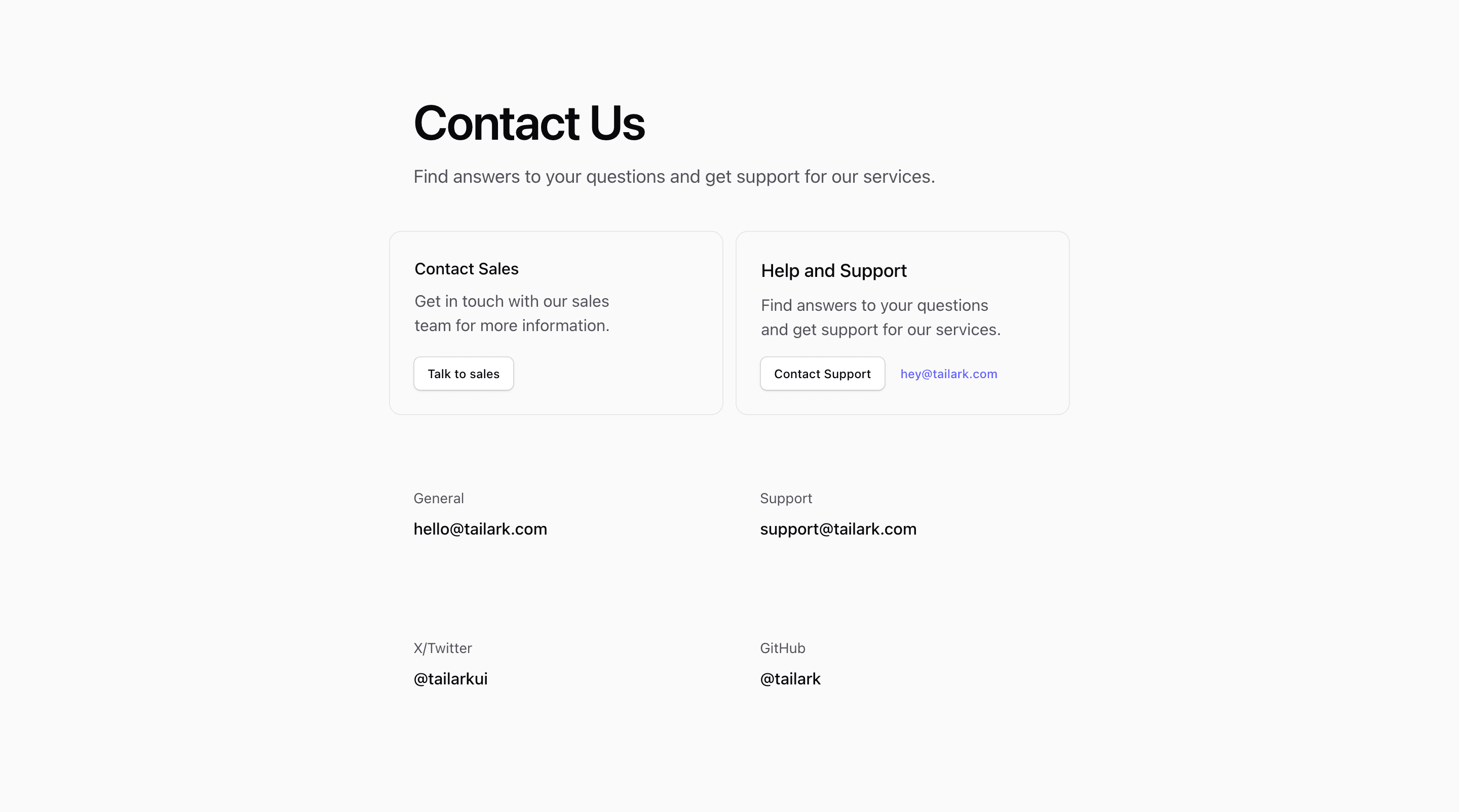
Shadcn Contact Block One is built for a page that needs clear contact routing before it needs data capture. The React source opens with Contact Us, then splits the first row into sales and support cards with shadcn Button actions. Below that, smaller rows expose general email, support email, X/Twitter, and GitHub links.
Because the implementation uses demo addresses such as hello@tailark.com, support@tailark.com, and hey@tailark.com, treat the copy and destinations as placeholders. The structure is useful for a SaaS landing page where sales, help, and community channels should stay separate.
Routing Pattern
This variant keeps the contact section light: two bordered cards handle the primary requests, while secondary links sit underneath as simple labeled rows. The @container wrapper and @lg:grid-cols-2 grid let the cards stack on narrow screens and pair up when the container has room.
Customization Notes
Replace every placeholder link with a real inbox, help center, or social account. Keep the short labels if your support model is simple; add service-level expectations only where they help visitors choose the right path. The Tailwind CSS border, rounded, and spacing utilities already provide enough separation, so the strongest changes are usually content and routing rather than visual weight.
Implementation Fit
Use this shadcn UI block when a contact page or support strip needs visible choices but no form. It is also a good companion to a larger contact form elsewhere on the page.
Frequently Asked Questions
Does this variant include a form?
No. The source uses links and buttons only, so form submission handling is not part of this block.
What should be changed before publishing?
Update the demo email addresses, the #link button targets, and the social URLs. Preview the grid around the container breakpoint because the first two cards become a two-column layout.
Related Shadcn UI Blocks
Start from Tailark
Build with Tailark
Production-ready marketing blocks, pages, and illustrations for Shadcn UI.