Shadcn Contact Block Nine
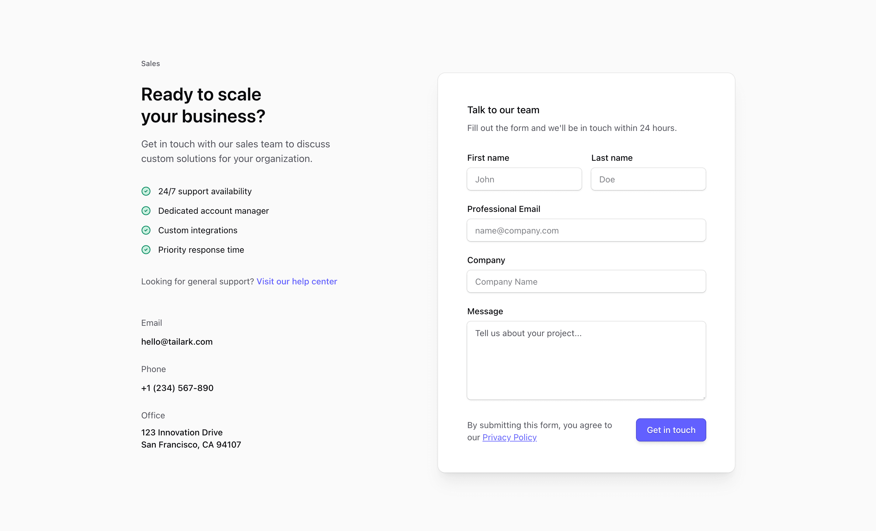
Shadcn Contact Block Nine combines sales positioning with practical contact details. The source labels the left column Sales, lists benefits, links to a help center for general support, and adds email, phone, and office information before the form card.
The address, phone number, email, benefit claims, and privacy link are placeholders. The pattern is useful, but those details need to match your actual sales and support operation.
Sales Column
The left side is a compact narrative: who the contact section is for, what benefits the visitor can expect, where general support lives, and how to reach the team directly. The benefit list uses CheckCircle2 icons for quick scanning.
Inquiry Form
The right side is a shadcn Card with labeled fields for name, professional email, company, and project message. The final row pairs privacy copy with a Get in touch button, and the sm:grid-cols-[1fr_auto] layout keeps the button aligned on wider screens.
Responsive Behavior
The source uses @2xl:grid-cols-2, so the sales content stacks above the form until the container can support two columns. That makes it safer to place in a narrower page column than a viewport-only layout.
Frequently Asked Questions
What kind of page is this for?
Use it for enterprise sales, custom plan requests, or a SaaS landing page where the visitor needs reassurance before opening a conversation.
Does it include backend form handling?
No. Add validation, submission, and privacy handling in your application.
Related Shadcn UI Blocks
Start from Tailark
Build with Tailark
Production-ready marketing blocks, pages, and illustrations for Shadcn UI.