Shadcn Contact Block Four
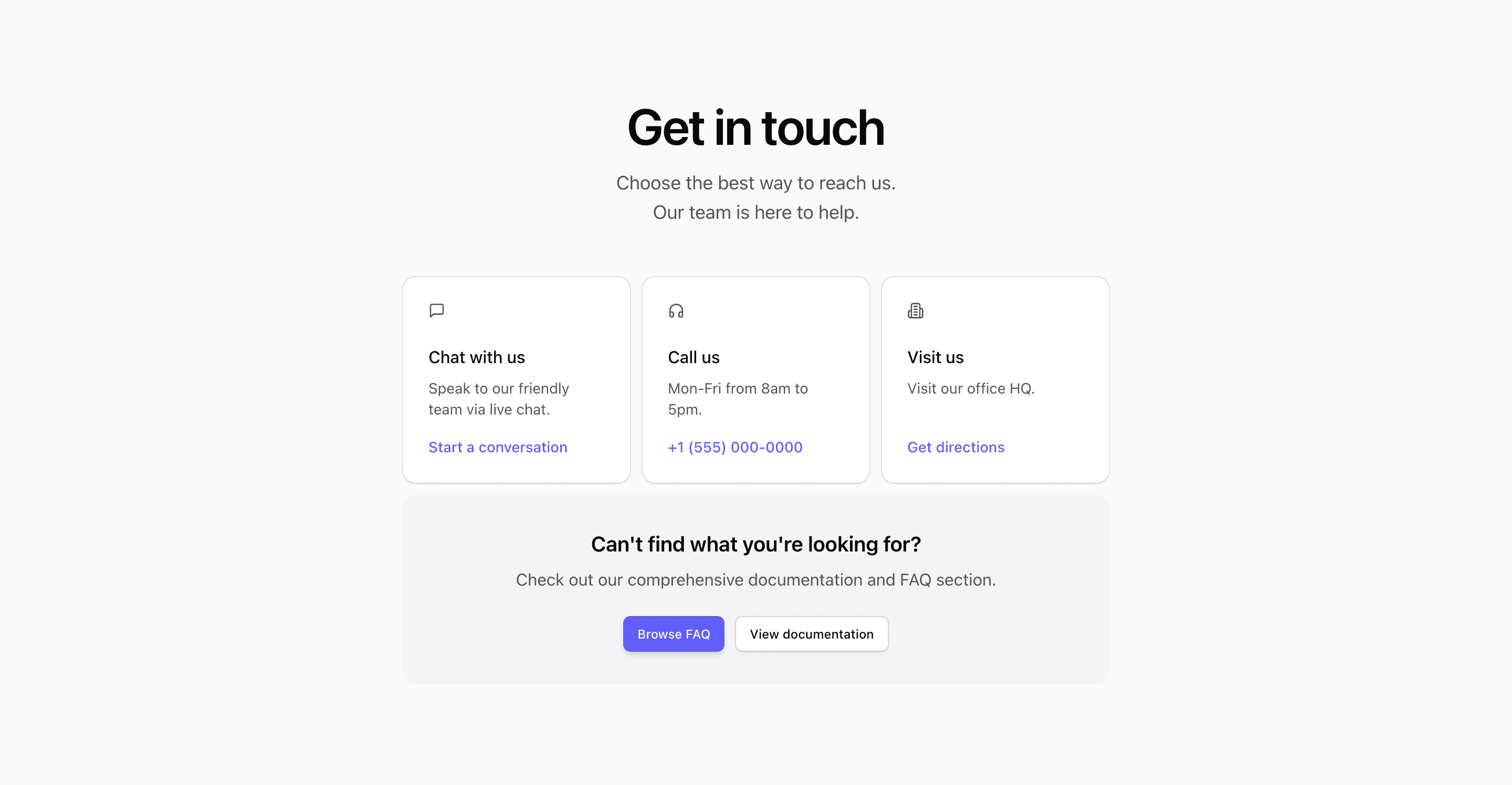
Shadcn Contact Block Four is built around channel selection. The source defines contactOptions for Chat with us, Call us, and Visit us, each with a Lucide icon, short description, action text, and link. A muted callout underneath points visitors to FAQ and documentation when none of the cards fit.
The phone number, #chat, #directions, #faq, and #docs values are demo destinations. Keep the structure, but connect each route to real support infrastructure.
Channel Cards
Each card is a shadcn Card with an icon, heading, short description, and inline link. The grid uses container breakpoints with @sm:grid-cols-2 and @2xl:grid-cols-3, so the three choices can stack, form a two-column rhythm, or sit in one row.
Support Callout
The lower bg-muted/50 panel is useful for deflecting simple questions to self-serve resources. If your support process relies on docs or an FAQ section, keep this callout close to the cards so visitors see it before opening a ticket.
Customization Notes
Use concrete hours for phone support, real chat availability, and a maps link only if the office accepts visitors. The Tailwind CSS hover shadow on the cards gives enough feedback without turning the section into a full dashboard.
Frequently Asked Questions
Is this better than a contact form?
Use this variant when the main job is routing people to existing channels. If you need structured lead capture, use one of the form-based contact blocks.
What content should stay short?
Card descriptions should stay to one sentence. Longer support policies belong in the FAQ or documentation links.
Related Shadcn UI Blocks
Start from Tailark
Build with Tailark
Production-ready marketing blocks, pages, and illustrations for Shadcn UI.