Shadcn Contact Block Eight
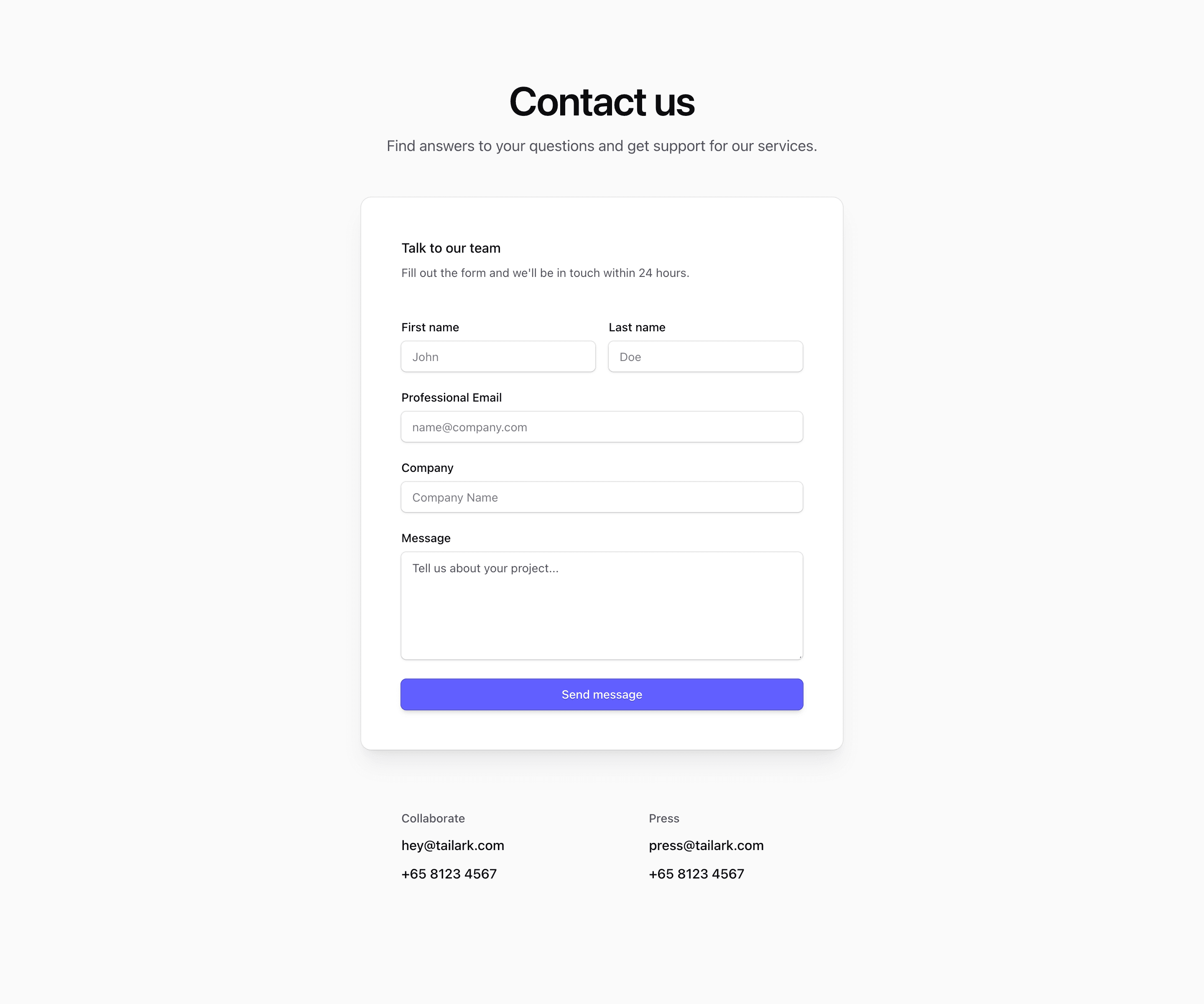
Shadcn Contact Block Eight places the form at the center of the contact section. The source renders Contact us, a shadowed shadcn Card containing the team form, and two lower contact groups for Collaborate and Press with email and phone links.
The contact data and placeholders are demos. Replace them with real inboxes, phone numbers, and form behavior before publishing.
Centered Form
This variant is narrower than the split layouts. The form card is capped at max-w-xl, uses md:p-12 for a roomy desktop panel, and includes first name, last name, professional email, company, and a taller message textarea.
Secondary Channels
The collaborate and press details sit below the form in an @lg:grid-cols-2 grid. That makes the form the primary action while still giving direct paths for media or partnership requests.
Responsive Behavior
Everything stacks naturally on mobile. At larger container sizes, only the lower contact details split into columns, which keeps the form focused and easy to scan.
Frequently Asked Questions
When should I choose this over a two-column form?
Use it when the page has one primary action and you do not need a large explanatory column beside the form.
What should be customized first?
Update direct contact links, connect the form submission path, and adjust the message field height if your expected requests are shorter.
Related Shadcn UI Blocks
Start from Tailark
Build with Tailark
Production-ready marketing blocks, pages, and illustrations for Shadcn UI.