Shadcn Call to Action Block Two
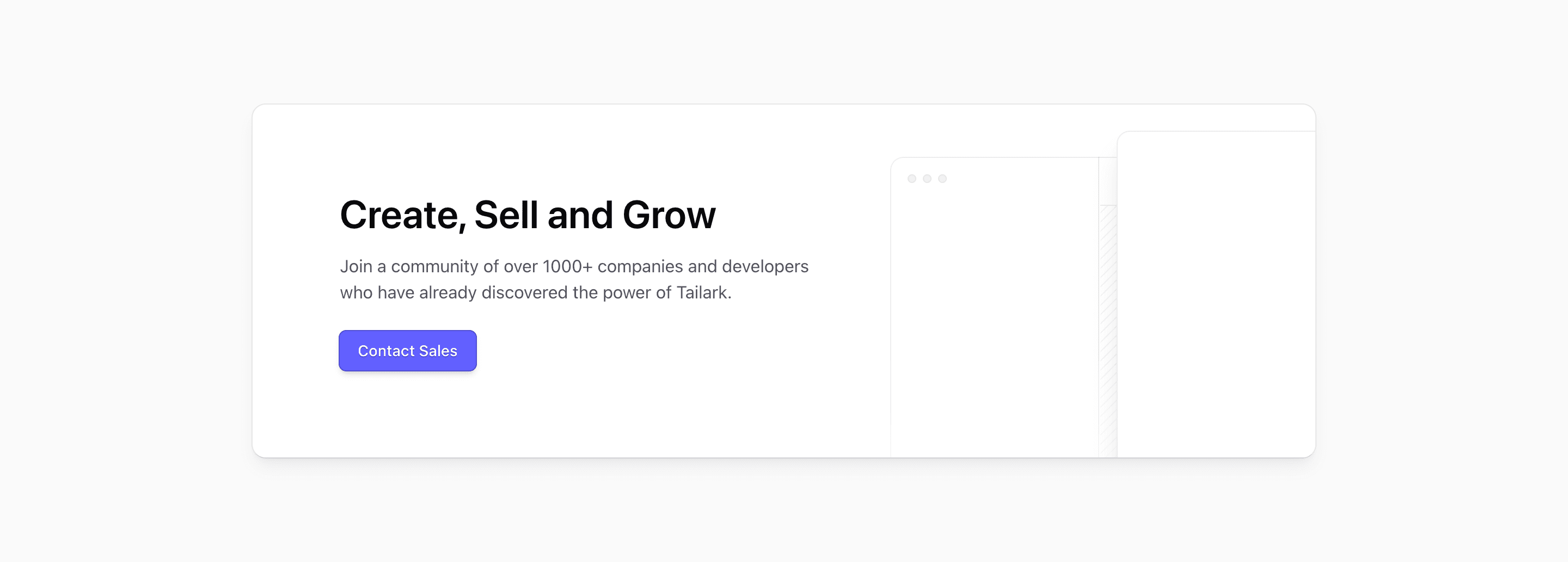
Block Two keeps the same headline, supporting copy, and Contact Sales button, but moves the content to the left and adds LayoutIllustration as a visual anchor. On large screens the illustration is positioned absolutely in the right two-fifths of the card; on smaller screens it drops below with a mask treatment.
Best placement
This version works when a call to action needs product context, not just a button. The illustration can reinforce the product category on a SaaS landing page while keeping the conversion path short.
Source-backed customization
The illustration import is local to the block, so adjust it with the CTA copy. If the product is not layout-related, swap the artwork rather than leaving a decorative graphic that promises the wrong thing.
What to wire before shipping
- Keep the left copy compact so it does not collide with the illustration.
- Replace placeholder proof with supportable product or customer language.
- Test the masked illustration state on mobile widths.
Frequently asked questions
Is this call to action responsive?
Yes. The source uses Tailwind CSS spacing, max-width, and responsive placement utilities so the CTA can fit a modern Next.js page without a separate layout system.
Can I customize the copy and action?
Yes. The block is React code built with shadcn UI blocks conventions, so the headline, supporting copy, button, form behavior, and decorative elements can all be changed in place.
When should I use this variant?
Use it when the conversion goal matches the source structure: a sales contact button, an illustrated sales prompt, or a waitlist email form.
Related Shadcn UI blocks
Start from Tailark
Build with Tailark
Production-ready marketing blocks, pages, and illustrations for Shadcn UI.