Shadcn Blog Block One
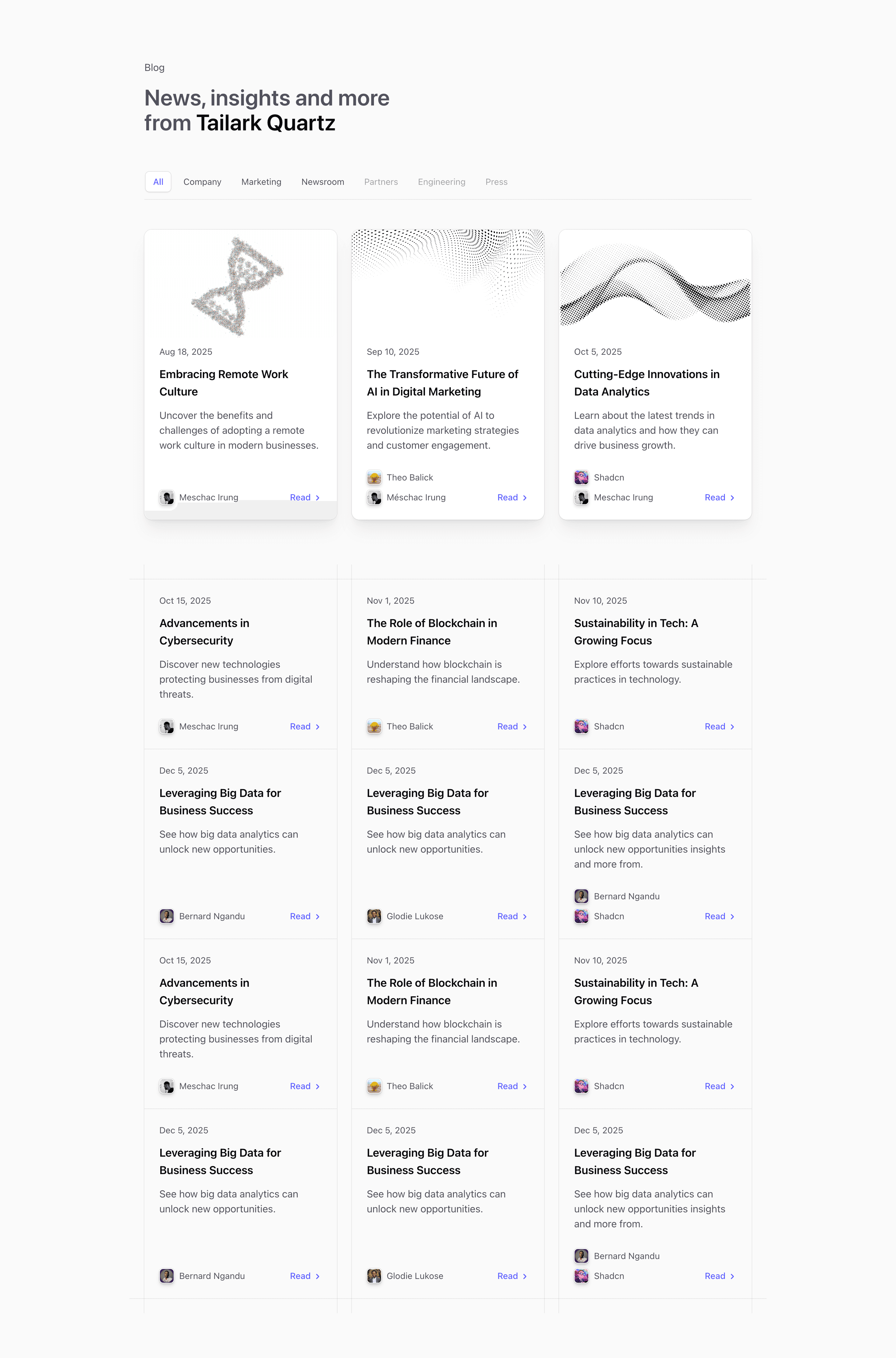
Shadcn Blog Block One is a client-side blog card layout. The source uses useState, useMemo, and useMedia to filter articles by category, show the first three as featured cards, and adjust how many trailing articles avoid a bottom border.
The article titles, authors, avatar URLs, dates, categories, images, and href: '#' values are demo content. Replace them with real CMS data, static content, or route-backed posts before shipping.
Blog Card Layout
The top cards use shadcn Card with grid-rows-subgrid, image headers, dates, titles, descriptions, author avatars, and a Read affordance with ChevronRight. The category bar is sticky and uses role="tablist" for the filter controls.
Responsive Behavior
The card grid moves through sm:grid-cols-2 and lg:grid-cols-3. useMedia changes the final-row border logic for mobile, tablet, and desktop, so list decoration stays tidy after filtering.
Customization Notes
Use this variant when a blog landing page needs both category navigation and strong visual cards. Wire categories to real content and replace placeholder href values with actual post routes in Next.js.
Frequently Asked Questions
Is this a server-rendered blog index?
No. The source is a client component because filtering happens in state.
What should be changed first?
Replace demo article data, remove duplicate sample posts, and connect the filter set to your real categories.
Related Shadcn UI Blocks
Start from Tailark
Build with Tailark
Production-ready marketing blocks, pages, and illustrations for Shadcn UI.