Shadcn Bento Block Two
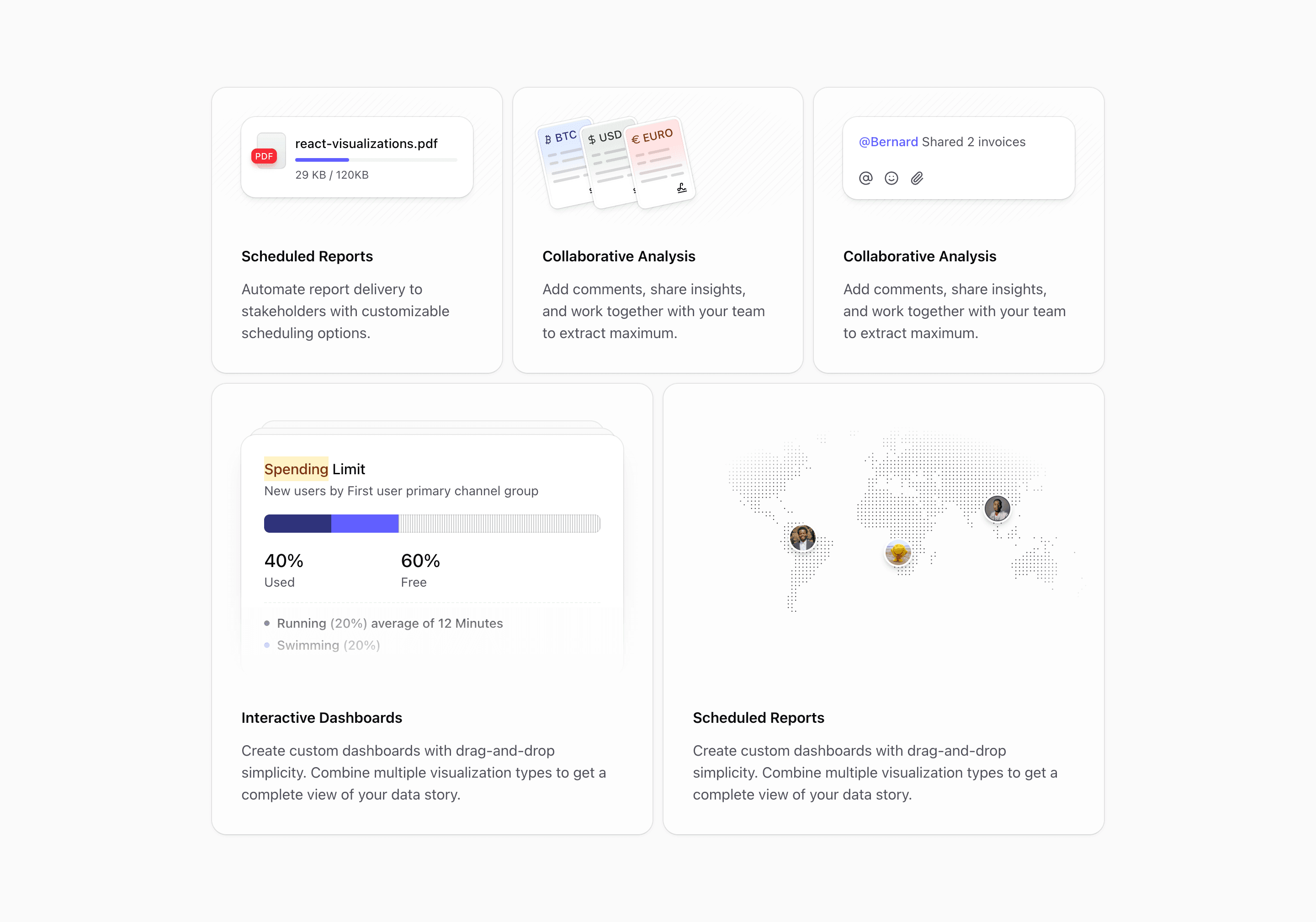
Bento block two flips the rhythm from block one. The visual comes first, then the copy. That makes the section feel more like a product gallery than a standard feature list.
The variant imports notification, currency, reply, visualization, and map illustrations. The first three cards are compact. The last two become larger feature panels: one for dashboards, one for geographic or coverage-oriented proof.
What makes this variant useful
This layout is strong when the screenshot or illustration should do the first pass of explanation. The top of each card is reserved for the visual, with the headline and paragraph placed underneath. That gives the page a more editorial rhythm and makes the section easy to scan.
The map card matters. Many bento grids only show charts and cards. This one gives you space for regional coverage, infrastructure footprint, delivery zones, customer locations, or any product story that depends on geography.
Best fit
Use this block for SaaS products with visual modules: analytics, logistics, finance dashboards, reporting tools, marketplace operations, and admin products. It also works for platforms that need to show breadth without writing a long feature section.
Implementation details
The code uses grid-rows-[1fr_auto] on several cards. That keeps the visual area flexible while the copy sits at the bottom. The section uses @container, @xl:grid-cols-2, and @3xl:grid-cols-6, with larger cards spanning two or three columns depending on the container size.
The map card uses a radial mask and a transparent background token, which keeps the illustration contained without a hard rectangular edge.
What to customize first
- Replace the map with proof that actually belongs to the product.
- Use the two large cards for the features with the most visual detail.
- Keep the visual-first order if screenshots matter more than copy.
- Shorten copy before changing spacing.
Frequently asked questions
Does Bento Block Two support dark mode?
Yes. It uses Shadcn-compatible theme tokens and muted foreground colors. Check any custom logos or map artwork after replacing the demo assets.
Is Bento Block Two responsive?
Yes. The grid collapses naturally through container-query breakpoints and grows into a six-column composition on wider containers.
Can I customize this bento block?
Yes. Every card, illustration, headline, and paragraph is normal React and Tailwind CSS.
What is the best use case for this variant?
Use it when your product needs visual proof first: dashboards, maps, reports, finance modules, or team collaboration screens.
Start from Tailark
Build with Tailark
Production-ready marketing blocks, pages, and illustrations for Shadcn UI.