Shadcn Bento Block Three
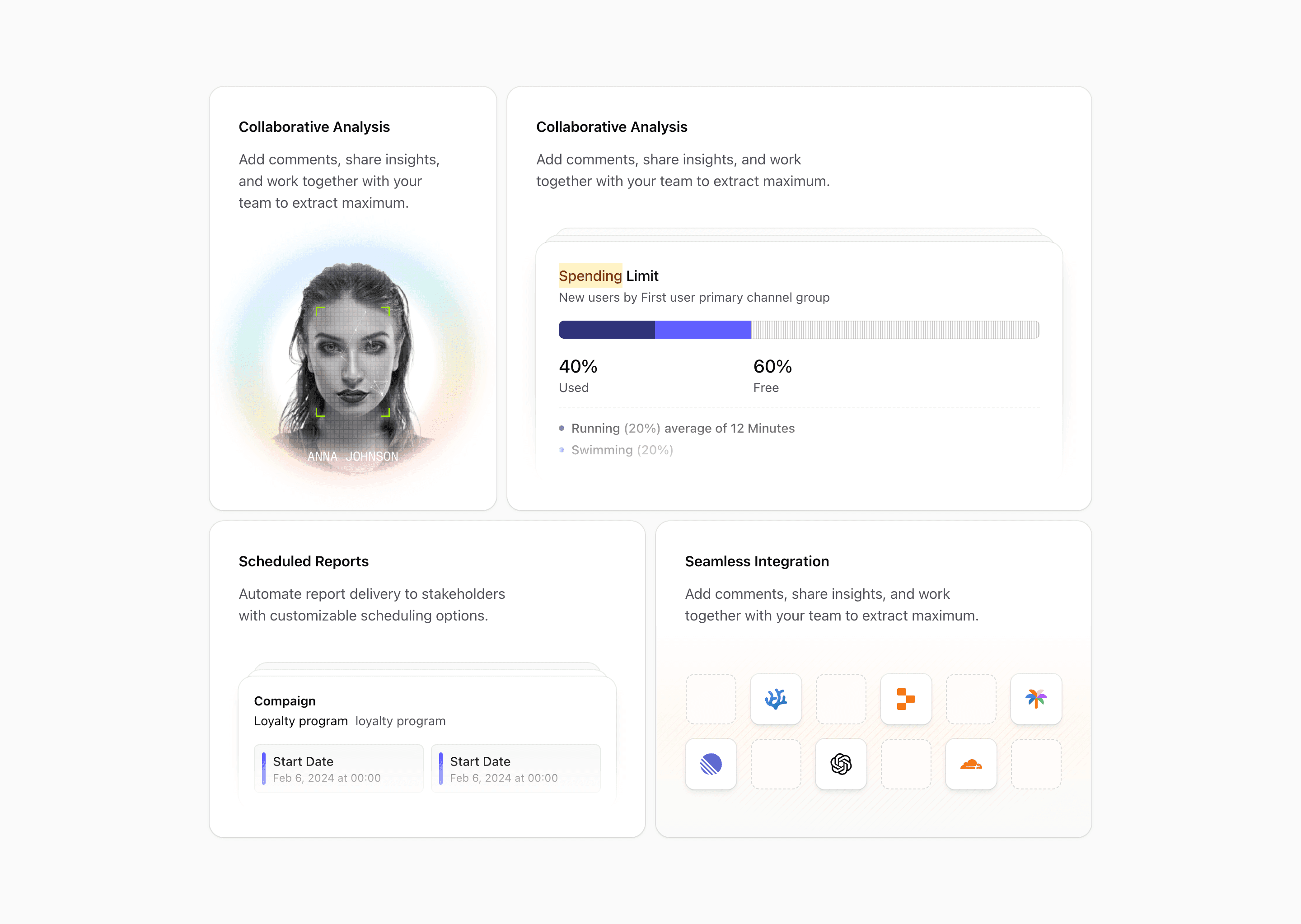
Bento block three is built around product credibility. It pairs a scan-style card, a larger dashboard card, a campaign card, and an integrations card with recognizable developer and AI logos.
The integration panel imports VSCodium, Replit, Google PaLM, Linear, OpenAI, and Cloudflare SVGs, then places them inside a responsive icon grid. That makes the section useful for products where ecosystem fit is part of the sale.
What makes this variant useful
This is not just a feature grid. It is a credibility grid. The scan illustration can stand for security, verification, imports, or analysis. The visualization card gives the product a serious dashboard surface. The campaign card adds an operational use case. The integration card answers the buyer's stack question.
If your product connects to developer tools, AI providers, workflow systems, or infrastructure platforms, this variant gives you a stronger structure than a plain logo cloud.
Best fit
Use this block for developer tools, AI SaaS, automation platforms, analytics products, and infrastructure products. It works especially well after a hero section because it can explain both product capability and ecosystem fit in one screen.
Implementation details
The grid uses @xl:grid-cols-2 and @3xl:grid-cols-6. The dashboard card spans four columns, while the scan card gets two. The bottom row splits into two three-column cards on larger containers.
The integration card uses dashed placeholder cells mixed with filled icon cells. That is a good detail: it keeps the icon grid from looking like a flat logo dump.
What to customize first
- Replace integration logos with the tools your buyers actually use.
- Use the large visualization card for the feature that needs the most trust.
- Keep the dashed icon rhythm if you want the integration grid to feel designed.
- Rewrite every placeholder headline around a concrete buyer outcome.
Frequently asked questions
Does Bento Block Three support dark mode?
Yes. The layout uses Shadcn and Tailwind theme tokens. After customization, check third-party logos in both themes.
Is Bento Block Three responsive?
Yes. The integration grid and bento columns adapt through container queries.
Can I customize the integration logos?
Yes. The logos are React SVG components. Replace them with your own integration icons, partner logos, or internal product modules.
When should I use this variant?
Use it when your product needs feature proof and stack proof in the same section.
Start from Tailark
Build with Tailark
Production-ready marketing blocks, pages, and illustrations for Shadcn UI.