Shadcn Bento Block Thirteen
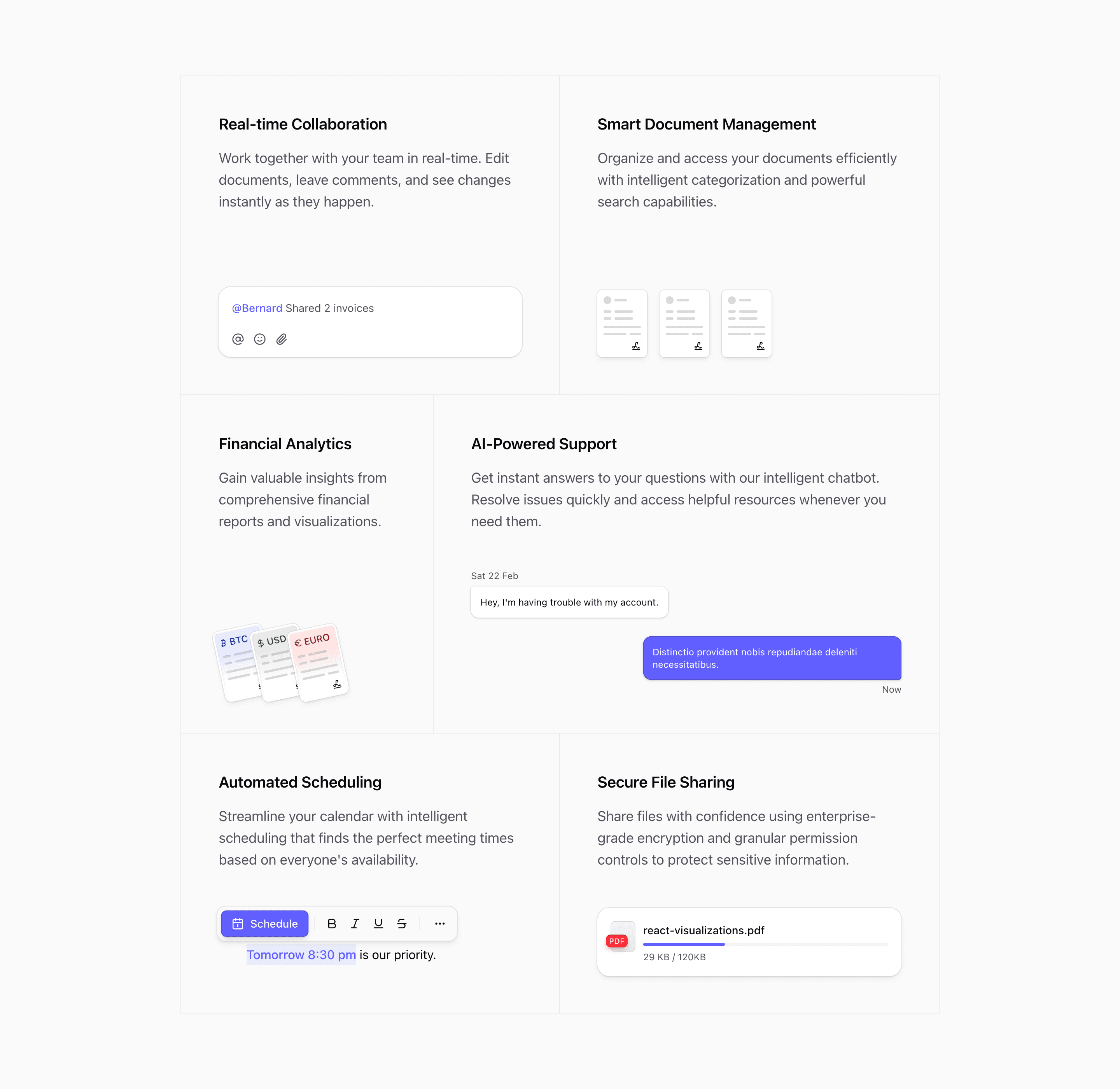
Bento block thirteen expands the bordered style into a six-column layout. It keeps the editorial feel of the later Bento variants, but gives some cards different widths so the section has more hierarchy.
The variant imports ReplyIllustration, DocumentIllustration, CurrencyIllustration, ChatIllustration, ScheduleIllustration, and FileUploadIllustration. The top row splits into real-time collaboration and document management. The middle row gives finance a smaller card and AI support a wider one.
What makes this variant useful
This block is good when you need more structure than a two-column grid but still want a calm, bordered layout. The AI support card spans four columns at the largest size, while financial analytics takes two. That gives the central feature more room without turning the section into a full hero.
The bottom row returns to two equal columns for scheduling and secure file sharing.
Best fit
Use this variant for collaboration suites, AI support products, file management tools, finance platforms, and products with one central feature supported by several surrounding workflows.
Implementation details
The wrapper uses @3xl:grid-cols-6 and applies padding to children with @3xl:*:p-12. Individual cards span three, two, or four columns depending on their role.
The layout uses grid-rows-subgrid, which keeps text and illustrations aligned across rows even when cards have different spans.
What to customize first
- Put the strongest feature in the four-column AI support slot.
- Use the two-column card for a compact proof point like finance, security, or metrics.
- Keep copy lengths balanced so borders stay visually clean.
- Replace file and document illustrations with real product states if available.
Frequently asked questions
Does Bento Block Thirteen support dark mode?
Yes. It uses standard Tailwind and Shadcn theme tokens across text, background, and borders.
Is Bento Block Thirteen responsive?
Yes. The six-column layout collapses down into a simpler stacked structure on smaller screens.
Can I customize the card spans?
Yes. The spans are Tailwind classes. You can rebalance the grid if another feature deserves more width.
When should I use this variant?
Use it when one central feature needs more space, but the surrounding workflows still matter.
Start from Tailark
Build with Tailark
Production-ready marketing blocks, pages, and illustrations for Shadcn UI.