Shadcn Bento Block Six
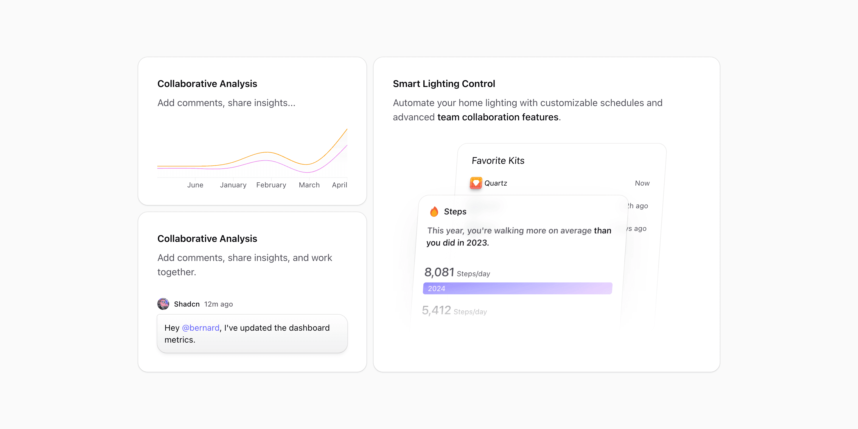
Bento block six is the cleanest Bento variant in this group. Instead of trying to show five or six product modules, it gives you two supporting cards and one large hero card inside the section.
The code imports ChartIllustration, MessageIllustration, and KitIllustration. The first two cards stack in a two-column side rail on large containers. The kit card spans three columns and becomes the visual anchor.
What makes this variant useful
A lot of bento sections fail because every card fights for attention. This one avoids that. The chart and message cards act as proof points. The large kit card carries the main product story.
Use it when you have one primary capability and two supporting reasons to believe it.
Best fit
This variant fits SaaS homepages, product feature pages, design tool pages, devtool pages, and small product launches. It is useful when the page needs a polished section but the product story is not broad enough for a six-card grid.
Implementation details
The grid uses @xl:grid-cols-2 and @4xl:grid-cols-5. The left column spans two columns and uses space-y-3 to stack two cards. The main card spans three columns and uses grid-rows-[auto_1fr] to place copy above a large illustration.
The copy includes an inline emphasized span inside the large card. That detail is useful when you want to highlight a phrase without introducing a badge or extra component.
What to customize first
- Put your core product promise in the large card.
- Use the two smaller cards for supporting workflows or proof points.
- Keep the total card count low.
- Replace the kit illustration with your strongest product visual if needed.
Frequently asked questions
Does Bento Block Six support dark mode?
Yes. It uses Shadcn-compatible background, foreground, muted, and card tokens.
Is Bento Block Six responsive?
Yes. The side rail and large card collapse into a readable stack before expanding into a five-column grid.
Can I customize this block for a small product?
Yes. This is one of the better Bento variants for a focused product because it does not require many feature claims.
When should I avoid this variant?
Avoid it if you need to show six or more independent modules. Use a denser Bento variant instead.
Start from Tailark
Build with Tailark
Production-ready marketing blocks, pages, and illustrations for Shadcn UI.