Shadcn Bento Block Five
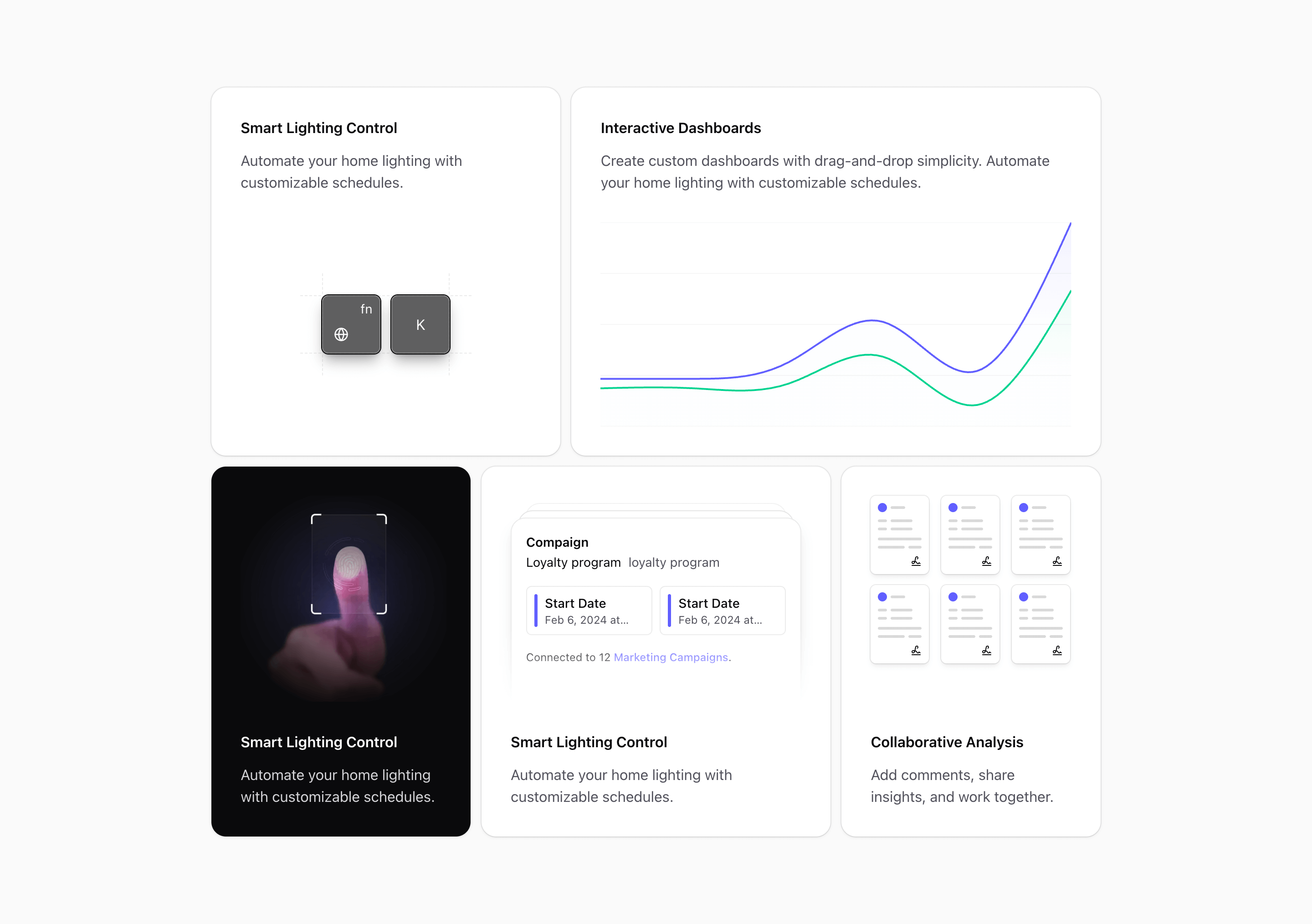
Bento block five is built for density. It uses a ten-column grid on large containers and divides the section into five cards with different spans.
The variant imports KeysIllustration, ChartIllustration, FingerprintScanIllustration, CampaignIllustration, and repeated DocumentIllustation components. That combination makes the section feel like a product operations dashboard: access, analytics, campaigns, and documents all in one place.
What makes this variant useful
The chart card spans six columns, which gives it the strongest visual role. A fingerprint card uses data-theme="dark", so one card intentionally appears as a darker security module inside the wider grid. The document card is moved to the first row on smaller layouts with row-start-1, which keeps dense visuals high on the page.
This is useful when the page needs a high-information feature section without turning into a long scroll.
Best fit
Use this variant for platforms with several operational surfaces: admin dashboards, security settings, campaign tooling, document handling, and analytics. It fits B2B SaaS products that need to look capable before the buyer reads every paragraph.
Implementation details
The layout uses @xl:grid-cols-2 and @4xl:grid-cols-10. Cards span four, six, three, four, and three columns at the largest size. The chart card sets --color-background to muted, while the fingerprint card opts into a dark theme.
The code also uses a compact document grid with six repeated document illustrations. That is ideal for upload libraries, knowledge bases, policy documents, or asset repositories.
What to customize first
- Put the most important product screen in the six-column chart card.
- Keep the dark card for security, AI, authentication, or a premium feature.
- Replace repeated document visuals with file types that match the product.
- Remove cards if your story has fewer than five strong claims.
Frequently asked questions
Does Bento Block Five support dark mode?
Yes. One card explicitly uses data-theme="dark", and the rest of the layout relies on Tailwind and Shadcn theme variables.
Is Bento Block Five responsive?
Yes. It starts as a single-column layout, becomes two columns, then expands into a ten-column bento grid.
Can I customize the chart and document cards?
Yes. The visuals are React components, so you can replace them with screenshots, SVGs, charts, or product-specific file previews.
When should I use this variant?
Use it when you need a dense feature section with one dominant dashboard card and several supporting operational cards.
Start from Tailark
Build with Tailark
Production-ready marketing blocks, pages, and illustrations for Shadcn UI.